Surprising A/B test results that defied best practices
There’s a reason why we test.
Because even the best, “best practice,” data-informed, user-requested changes don’t always perform as expected. And there’s a variety of reasons why things might not turn out the way we expect them to, from interpreting causation rather than correlation within datasets to a design execution that’s not quite working.
What’s important is to figure out the ‘why’ behind the results in post-test analysis. Tests that defy our expectations can teach us more about our users, their behavior, intentions, wants, and needs than winning tests. Making the insights and learnings from such tests very valuable for the next test we run.
So, we asked 16 experimentation experts to share a test result that surprised them and their insights about why things didn’t turn out as planned. The following is also a fantastic resource for any colleagues who don’t understand why we test ideas that they are “sure” will work.
1. Adding friction improves conversion rates
The best practice of removing friction from an experience to make it as easy as possible for users to convert isn’t always going to work. There are some scenarios where friction can help conversions, as Shiva shares;
Simplicity principle. Makes sense - right?
Less is more? "Less Friction?"
Wrong.
I’ve tested this a few different times. The "rule" is that there is no rule to this kind of thing - it truly depends on a number of things.
I had a lead gen form where we had 6+ steps to convert users. So we reduced it to 3 steps and saw a HUGE drop in conversion rate.
So we tested the 'anti-hypothesis,' namely, ADD steps (thinking steps = trust building).
Added a step to the beginning of the form and saw an increase in conversion rate. Never blindly follow 'best practices' - always test them.”

With Shiva’s example in mind, should “adding friction” also be a best practice? Jakub discusses his findings on whether unexpected results are down to randomness or are, in fact, sub-patterns.
Given their probabilistic nature, there’s ample room for test outcomes to surprise us, as in the fewer form field pattern.
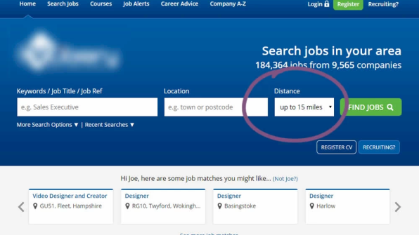
An experiment by a leading UK job site removed the ‘distance’ field from the search bar with the expectation of increasing job searches.
But the total searches dropped significantly. One explanation is that users wish to express additional information that increases relevance. e.g., wanting to search for jobs within a given commute radius. A few months later, Booking also detected a similar conditional exception to the general pattern when they added an additional “number of children” filter into their existing search bar.
This showcases how a general pattern breaks out into smaller ones laced with contextual conditions.”

2. Delay the Call To Action (CTA)
An omnipresent CTA button feels like a great way to capture interest no matter where the user is in the journey, but unless the user is ready to buy, isn’t it a waste of space that could be used for something more valuable? Lydia shares an example;
A real-life example: When working with an architect exam prep company, we discovered that placing value propositions in the top section of the page had a greater sales impact than buttons leading to top products. For this specific audience, delaying the button and first explaining the benefits boosted revenue by 70%.”

We ran a test recently for a Direct To Consumer (DTC) eCommerce brand where the call to action was low down on the mobile site.
We hypothesized that raising awareness by triggering a sticky footer CTA when a user scrolls up will nudge more people to interact with it.
But the results were flat. We observed a slight increase in total add-to-cart numbers, but this didn't translate into more orders or revenue per user. With this type of test, you’ll need to iterate on the execution to find a UX that positively impacts the business.”

3. Removing cross-sells increases AOV
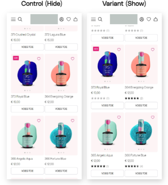
Claire's example below illustrates why sweeping statements (like the above heading) are dangerous to apply blindly. We need to dig into what caused test outcomes. This is a great example of where follow-up research and subsequent testing can prove useful to unearth the underlying cause for the findings.
Control: two cross-sells
Variant 1: one cross-sell
Variant 2: no cross-sells.
Variant 2 performed best across all KPIs: Conversion Rate, Revenue Per User, and Average Order Value. This was very unexpected because the cross-sells would help get most users past the free shipping threshold, and in our research, users indicated that they were looking for other products to "stack" with the ones they were purchasing.
The removal of the cross-sells performed better on mobile, but on desktop, the variant performed only marginally better and with low significance (77% probability).
It's likely that the placement of the cross-sells on mobile interfered with users' checkout experience and became a friction point, or the products shown in the cross-sells weren't relevant or explained well enough to convince the user to purchase.”

4. Product videos drive users to purchase, right?
Encased in this example from Jonny is an excellent lesson about assuming causation between variables;
This company had gone down this route because they had run an analysis that showed that people who watch videos are more likely to purchase. They had incorrectly inferred that this meant videos caused purchase behavior.
Unfortunately, this is a classic case of a cause/causation fallacy. People who watch videos are more likely to buy even before they watch the video; they want the video because they are already close to buying. The videos made no difference to the purchase; hence, the investment in the content was unnecessary.”

5. Add ticker announcements to improve revenue
Unless it’s used to show breaking news, I feel most websites should avoid scrolling ticker announcements. Yet here we are with surprising results number five;
The scrolling variant crushed it on click-through, with +38% more clicks vs. control, resulting in a modest improvement in revenue per visitor (+3%) and bounce rate (-1.2%).
We subsequently A/B/C tested the scroller (on a gray background, as Control) against a version with emojis on gray background and no emojis on a yellow background. The yellow variant achieved an extra 50% click through, 7% conversion, and 5.5% revenue lift. (We did not include a variant of emoji + yellow due to lack of contrast). Color me wrong about animated sitewide elements. It worked for this niche electronics retailer!”

6. Autoplay next video decreases content per session
When optimization heavyweights like YouTube, Spotify, and Netflix all employ the same UX patterns, it feels like a sure bet. But the execution of an idea is vital in whether it performs positively or not, as Léa shares;
The test resulted in users finishing content -16% less often and -24% reaching the end of a piece of content per session—indicators of lower engagement and lower retention.
We hypothesized that autoplay was a good idea in theory, but its success depended on the quality of the content being played next. In that first test, the next piece of content was recommended based on category and popularity and may not have been good enough for niche categories. This was supported by the data showing more users starting new content but dropping off soon after. It was a great finding highlighting the importance of building a stronger recommendation algorithm, which we did.”

7. Leave the animated carousel alone
Ridiculed among designers, everyone loves to hate carousels. But is the hatred justified? In Melanie’s case, maybe not;
Surprisingly, we saw a statistically significant drop in conversion. We hypothesized that this was due to fewer offers being visible, as customers were not opting to swipe through beyond the first pane. Follow-up tests with a grid view of offers, which displayed value across key product categories and confirmed this view.”

8. Social proof harms conversions
Considering how widely used social proof is and that even negative reviews can increase customer spending, it feels like a no-brainer. So, It’s fascinating to read examples where it doesn’t work.
The test we ran was adding social proof (star ratings & numbers of reviews) onto product landing pages to increase the conversion rate and ratio of users who view the product detail page.
But the results were flat. We assume it was due to the extended page length caused by adding the review element, making it harder to navigate. We’ll be running follow-up tests to experiment with different designs and placements.”

There are other reasons why social proof can harm conversion, as Ton demonstrates in his example;
Over the years, however, I hypothesized that it only works well for products and services you would proudly brag about in your social environment when you got them. If TikTok is socially accepted in your environment, you would happily share that you created an account. But if the product is not socially accepted, for instance, getting a loan to make sure you can pay your monthly expenses, then social proof could trigger an unexpected effect.
For example, while working for a company offering loans (with a strong background check - to see if you could carry the economic consequences), I expected social proof about the number of loans they already granted would positively affect the number of leads coming in. It, however, led to a significant negative effect on the number of incoming leads, and lowered the quality of leads. Something to consider when applying social proof, and remember: social acceptance differs per culture and subculture.”

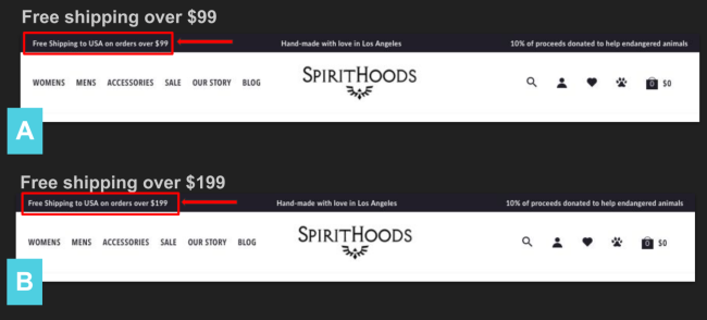
9. Customers willingly spend more money
Why would customers choose to spend more money just to get something for free? Once you read this case study, you’ll realize the importance of using what your customers want as a motivator, the power of ‘free,’ and why conversion rate isn’t the be-all and end-all;
It turned out that shoppers were willing to spend $100 more to get free shipping, with Version B winning at a statistically significant 90% confidence. The higher shipping threshold contributed to a comparable 24% increase in Revenue Per Visitor (RPV) and a 5.6% lift in Average Order Value (AOV).”

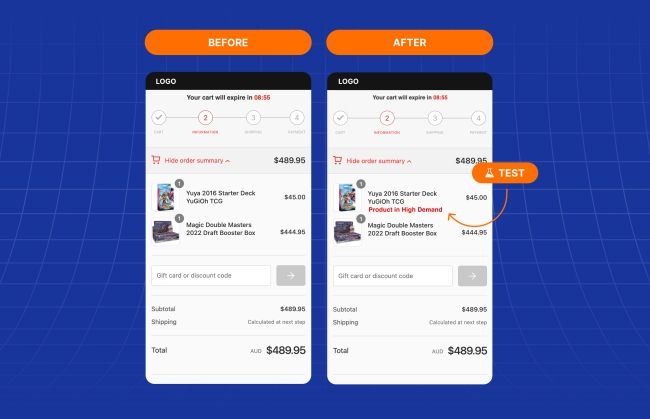
10. Scarcity scares away customers
Using scarcity is another widespread practice, but it must be applied carefully. Just because a tactic works on one part of the user journey does not guarantee it will work everywhere (even on the same website, with the same customers).
Research and previous testing on the product page showed that implementing scarcity tactics yielded great results. However, the analysis also showed a high checkout abandonment rate. We decided to apply these learnings in a checkout test using scarcity.
We set up a test that displayed the text ‘Product in High Demand’ next to products that were very popular, low on stock, and were in the customers’ checkout. We hypothesized this would encourage people to complete their transaction, knowing the product wouldn’t always be available.
The test lost. Despite this persuasion principle working on the product pages, in the checkout, it backfired. The conversion rate dropped, along with transactions and revenue. We learned that many of the core user groups were put off by the messaging. It was a good reminder to always consider the mindset and attitude of your customers and how this might change at different stages of the user journey."

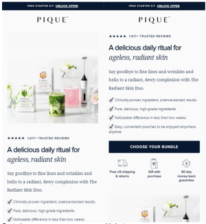
11. An image is worth a thousand words
Wait, this isn’t surprising? In fact, the catchphrase was around before the internet was invented. While this idiom rings true in the following two examples, the assumptions as to why it wouldn't work provide a good reminder about not relying on our gut instincts or best practices, as Gursimran found;
However, the variant saw a 9.55% reduction in click-through rates with 99.97% statistical significance and a 16% reduction in conversion rate with 98.91% significance.
Because the website sells drinkable health supplements, we think the lifestyle image in the control helped users see the product in action. The picture helped users understand what they were buying and how to use it and thus created more intent to buy than the copy explaining the product's USPs. The USP copy likely left doubts in the users' minds about the product and, hence, the lower conversion rate."

Following on from Gursimran’s example, Tania was also surprised by the impact of an image;
We hypothesized that the higher price point raised doubts about the brand and product, leading to a high drop-off rate. We decided to test the addition of a visual ‘certified’ stamp immediately beneath the Add to Cart button, which showed that three leading bureaus had approved the gemstones.
The conversion rate for the variant (adding a visual certified stamp) surged to 1.60% (at 99% significance), boasting a 177% improvement.
Sure, this makes sense; badges and security icons can help build trust, but for me, what was striking was that the certification information was already present in written format within the product specification. Considering the premium nature of the product, I had assumed that users would meticulously examine the available information, so adding a visual certification covering the same information would have little impact.”

12. Removing charity donation messaging increased charity donations
Our final counterintuitive test result helps illustrate why you need to track a range of business metrics to establish the true impact of a test. As well as learning that just because something feels right doesn’t mean it will have the expected effect, as Yusuf found;
Emphasizing social responsibility messaging is not a guarantee of improved sales. The takeaway is NOT to abandon philanthropy but the importance of experimenting with messaging and placement. Every brand and customer set responds differently.”

Learnings from 12 unexpected test results
While you can increase your test success rate by crafting data and research-informed hypotheses and calling on known patterns and principles, success is never guaranteed.
Whether the principle isn’t suitable in the context, the design or copy doesn’t resonate, the users are in a different mindset, the usability is impacted, or the hypothesis is formed around an incorrect assumption, there are a whole ton of reasons why you might be surprised by your findings. That’s why we test. But also because understanding the results and digging into what caused them leads us to create even better customer experiences.
A big thank you to Shiva Manjunath (Motive), Jakub Linowski (Linowski Interaction Design), Lydia Ogles (Vivint), Ben Labay (Speero), Claire More (SplitBase), Jonny Longden (Journey Further), Linda Bustos (Edgacent), Léa Samrani, Melanie Kyrklund (Specsavers), Shirley HC Lee (Ask Phill), Ton Wesseling (Online Dialogue), Deborah O'Malley (GuessTheTest), Jason O'Dwyer (Conversionry), Tania Bhattacharya (Webistry), Gursimran Gujral (OptiPhoenix) and Yusuf Shurbaji (Prismfly) for sharing their surprising tests with us.