Risk-free A/B testing for banks and financial services

A/B testing is a way to make data-based decisions about what's working or not when serving your customers.
However, within the financial industry, compliance is top-of-mind. Many companies don't know how to use the data they collect to improve messaging and customer experiences, or they're too afraid to scale their experiments because of the perceived risk.
But those that do use data for CX and optimization grow 3.1x faster than those that don’t. As a marketer, how can you start bringing optimization into your organization without risking user privacy or violating consent? The answer is A/B testing.
The Gramm-Leach-Bliley Act (GLBA) requires financial institutions to explain how they share customers’ information and personal data. That includes personally identifiable information (PII) such as:
- Name
- Contact details (address, email, phone number)
- Bank account numbers or other account numbers
- Social Security Number (SSN) or other government-issued numbers
- Date of birth
- Mother’s maiden name
There’s plenty you can A/B test without running afoul of any regulations or using PII at all. Regardless of whether you’re creating mortgage loan landing pages, banner ads for a new high-yield savings account, or an application page for a new rewards credit card, you can A/B test on-page elements like headlines and CTAs, lead-capture elements, landing page, as well as accessibility features to maximize and improve conversions of your marketing campaign.
1 On-page elements are a quick way to start optimizing
A/B testing on-page elements can help your visitors be more engaged with your digital products and prepare them for sales conversion. Two examples of these are website headlines and call-to-actions (CTAs).
Website headlines
A/B testing headlines allows you to determine what kind of language and format works for your audience groups or potential customers regardless of their demographics. You have a few options when it comes to headline format, including:
- What you are. Explain what the page or product is about.
- What you offer. Lead with the benefits you receive when you sign up.
- What you enable. Explain what you can accomplish with this product or service.
For a new account product page, you could write up two variations. A “What you get” version might explain the benefits of the account, such as higher interest rates, lower monthly cost, or free with a minimum balance. A “What you’re able to do” version might suggest you can afford to go on a new vacation with the money you save with this new account. If the first one does better, that might suggest the benefits are what’s important to your audience, and they’re comparing your product to other similar ones on a granular level. If the second one outperforms the first, your future marketing might focus more on painting a picture for your audience rather than listing APRs.
Once you’ve run the A/B test long enough to have solid results to analyze, you can determine which headline performed best and change it on the page. Doing so can improve many metrics, e.g. reduce bounce, increase clicks, optimize funnel, etc. To test these kinds of headlines, you don’t need any PII; you just need to figure out what your audience is looking for when they’re reading about your product or service.
Call-to-Actions (CTAs)
The CTA is what drives your visitors to take a specific action on your website or any of its landing pages — whether that means signing up for a newsletter about paying off debt faster, filling out a loan application for their first home, or opening a checking and savings account. But if the copy on the button doesn’t entice your visitors or target audience, the conversions will be disappointing.
If you’re not getting the conversions you want from a specific type of visitor or potential customer, testing the CTA can help provide some important information on the problem. One thing to remember is that A/B testing isn’t always just about the words on the page. In the case of CTAs, you can also test visual variables, like the color of the button. Though even the perfect color won’t hypnotize your readers into clicking, a CTA button that stands out appeals to our more primitive brain (“lizard brain”) and draws us in, even if we don’t know it’s happening.
Say you have a loan application page that’s underperforming. You could test two CTA button colors: one, the button that’s already there. Perhaps it’s blue to match the rest of your site’s blue, gold, and white branding. For the other color, try something that will really pop: red. A color that’s not “on brand” might draw the attention it needs.
Once you settle on a color, test the words. Do your readers prefer action CTAs, like “submit” or “apply,” or do they prefer to “receive free information” or “start saving today”?
Only by testing will you truly learn what prompts your visitors to take action. Again, none of these tests — button color or copy — involve collecting or sharing PII, so you can feel confident in testing these without worrying about compliance issues.
2 Improve your lead capture forms and funnels without using PII
In the financial industry, testing your lead capture for your digital products (such as web forms and applications) can make or break your first-party data. There are several elements of your lead capture forms that can impact their completion rate, such as:
- Input fields: How many fields are required (ex: 3 vs 10)
- Alignment: How are your field labels aligned (ex: top align, left align, right align)
- Field labels: What you name the individual fields (ex: “Contact” vs “Name”)
- Design: How you design the form (ex: colors, fonts, shape)
- Auto-fill: If your form that recognizes auto-fills vs having to manually fill out every section
- CTA: The design of the action button (ex: copy, color, shape)
- Login: Does the user have to log in or can they complete the form without an account
- Placement: Where on the page you place your form (ex: on the right side, center, in a pop-up)
- Privacy: Do you put the privacy copy directly on the form, or link to it on a separate page
If we look at input fields, there’s research to show how your conversion is directly proportional to the number of fields.
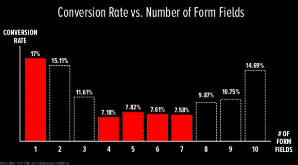
Source: Presentation by Oli Gardner, co-founder of Unbounce, at Marketing Festival
So the more fields you have, the lower your conversion rate... except between four and seven fields where the rate fluctuates up and down, and then at eight and nine fields, the rate starts to increase. Suddenly at 10 fields, the conversion rate jumps from 10.75% to 14.69%. Meaning, if you’re going to put eight fields, you might as well put 10.
What this research shows is that you can only know the sweet spot of how many input fields by conducting the appropriate A/B test with your particular forms. A loan application form might require more fields than a gated ebook on maximizing your savings. Testing is really the only way in which you’ll find out exactly how many fields will increase your conversions.
Another element of your form or application that you can test is how you align the input field labels. Another element of your form or application that you can test is how you align the input field labels. Though this might seem trivial, it can make a big difference when it comes to conversions. Results found that putting the label above the form resulted in better conversions because “Users aren’t forced to look separately at the label and the input field.”
Though you can easily argue this is the case for all website visitors, A/B testing your forms is the best and most reliable way to know what your particular clients prefer.
3 Make your website more accessibile to different users
Web accessibility or usability is about making the internet available and usable to everyone with diverse abilities, technologies, and situations.
When speaking about making the web accessible for those with disabilities who would otherwise limit their interaction on the internet, however, web accessibility also refers to those who:
- Are using different tech (smartphone, smartwatch)
- Might have situational limitations (outside on a sunny day)
- Have a slow internet connection or limited bandwidth
Your digital financial products should have an accessible design, not only so as to not discriminate but also that it improves your overall user experience (UX) no matter who is using it or how. The World Wide Web Consortium (W3C) says, “Accessibility can enhance your brand, drive innovation, and extend your market reach.” This is why A/B testing your site’s accessibility is important.
If we take mobile accessibility as an example, in the U.S., in 2020, desktop website views accounted for only 36% compared to mobile at 61%. If we take mobile accessibility as an example, in the U.S., in 2020, desktop website views accounted for only 36% compared to mobile at 61%. Globally, desktop dropped to 29% while mobile increased to 68%. This means if your digital products aren’t optimized for even just mobile accessibility, you could be missing out on two-thirds of the market who are mobile screen readers.
Suppose your hypothesis is that visitors to your website or webpage on mobile are bouncing (leaving) because there is too much information on each page to scroll through. (There’s a lot of thumb-scrolling fatigue.) The control, or variation A, will be the site as it stands with no changes. The test, or variation B, will be a mobile site that has less content on each page but with hyperlinks to more information for each section.
Take a credit card comparison page as an example. Typically, you’ll list the different types of credit cards offered in separate columns, with each of the variables (interest rate, annual fee, special offers, etc.) listed on each row for easy comparison. But on mobile, this would be very hard to follow. Your test or variation could be having drop-downs instead of having all the information listed together, or alternatively, selecting two credit cards to compare side-by-side instead of all of them at once.
Remember, the goal is to know if your proposed hypothesis is true or false, and you determine that by seeing if your test has the same effect, no effect, or better effect with your clients. It’s also advisable to only test one thing at a time since this makes it easier to interpret the results and come to a conclusion.
Once you’ve tested for long enough, and have the data to show your visitors’ preference, then you can make the appropriate changes (or not) and be sure your mobile visits, page views, or number of visitors will result in a better user experience and accessibility standards.
Moving forward with A/B testing your financial products
When you’re ready to put your clients at the forefront of your marketing and increase conversions, A/B testing will ensure you’re providing the best experiences for them, bar none. Kameleoon offers free courses and certifications for A/B testing, where you’ll learn all you need to get started to put your business at the top of the financial industry’s marketing game with the financial products that help your clients in terms of ROI.
You can learn more about how banks and financial services companies are using these strategies to improve customer experience on their platforms in our report on the finance industry by Forrester.