Addressing customer concerns: 22 online banking examples to drive better test ideas

Every year, over 1,600 US bank branches close, leaving millions relying on digital banking for their everyday needs. Yet, 20% of them abandon online processes due to frustrating experiences.
But customers' views of what constitutes a ‘good experience’ has changed thanks to the rise of neobanks. These digital natives have revolutionized how we open accounts, send money, and manage finances. To remain competitive, traditional banks must assess customer pain points and their expectations regarding solutions.
This article showcases real-world banking examples addressing common customer pain points to inspire your next hypothesis solution session. Discover online banking test ideas and find out how TD Bank, Scotiabank, Chase, Metro Bank, Lloyds Bank, N26, Monzo, Bank of America, Wells Fargo, Revolut, DBS Bank, and Starling Bank solve the following problems:
- Distraction during the online application.
- Concerns about making online payments.
- Confusion over which financial product to apply for
Confusion over which financial product to apply for
A potential customer has to make a big decision right after landing on your website or app: which financial product to apply for?
While an individual might know the type of product they need (e.g., checking account, mortgage, etc.), most banks have multiple offerings. Bombarding the user with information and too many options can trigger the paradox of choice, where they struggle to make any decision.
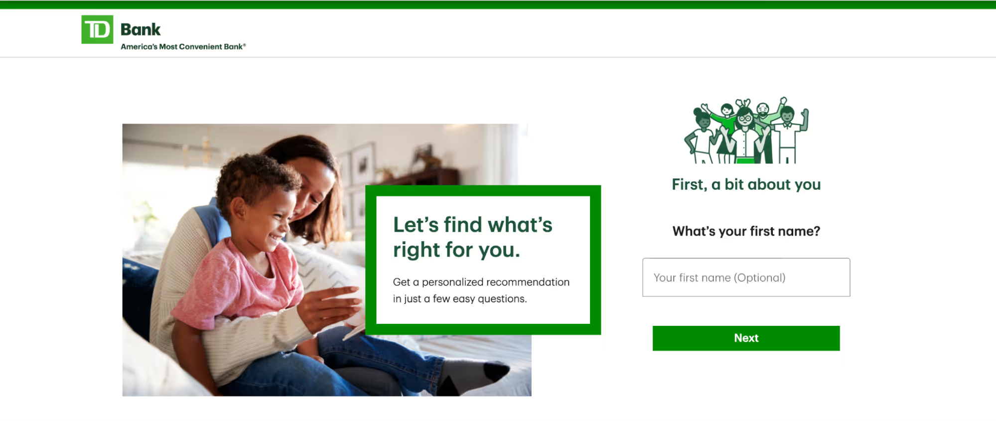
To resolve this issue, TD Bank's questionnaire, as shown in the screenshot, mimics a personalized in-branch experience, addressing users by name. After a few questions, the best products are suggested, along with a summary and more information.

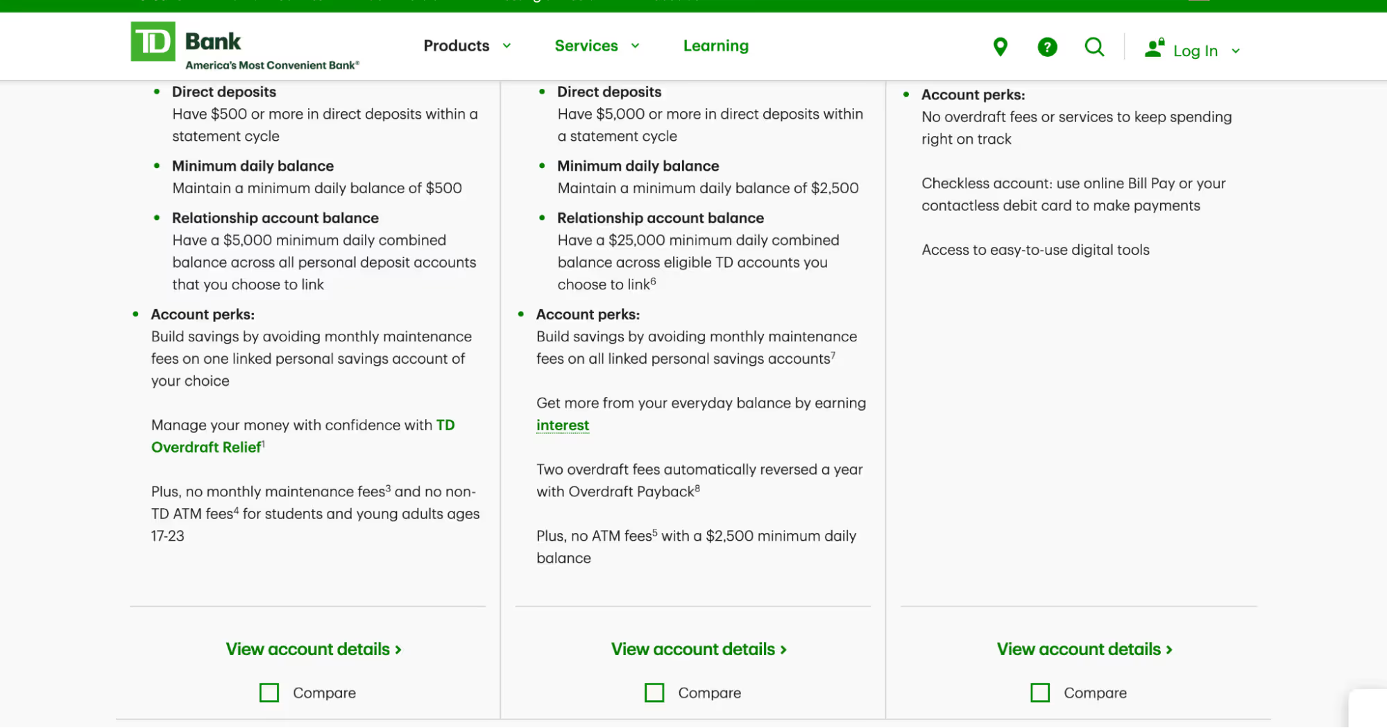
TD Bank also offers a “compare” feature, which helps the user decide between multiple recommendations.
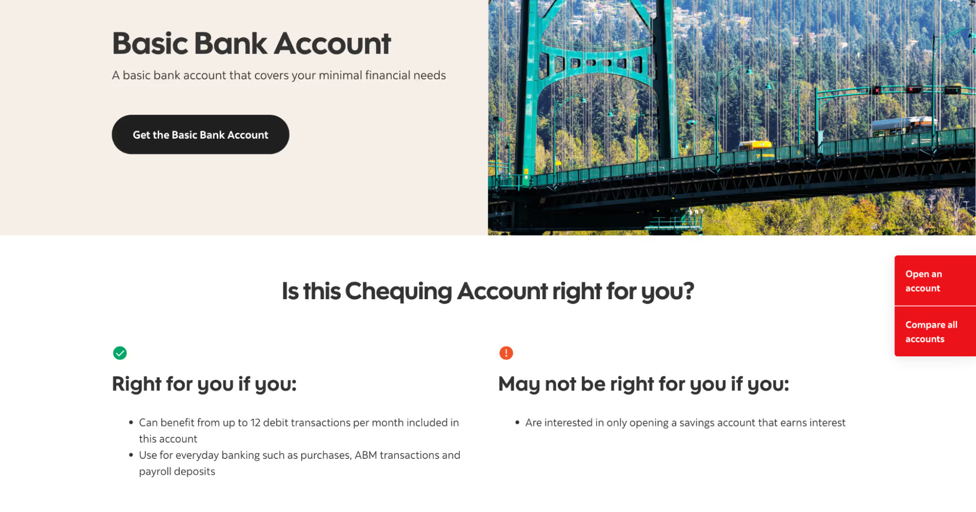
Below, Scotiabank indicates who each account is and isn’t suitable for in a visually clear way. Neither customer nor bank wants to waste time opening accounts that aren’t used, so putting this information upfront is a great way to qualify people before they start the application process.
Certain financial products have eligibility criteria. If that’s the case, include this information before a user starts to fill in their application, as Chase does in the example below.

If your research shows that people struggle to decide which financial product is right for them, then A/B testing potential solutions is a great approach. Consider running tests for your online bank on decision-making tools, comparison features, or designs and copy that clarify who products are for.
The next hurdle is engaging customers through lengthy application processes. Distractions during the online application process In a world full of distractions, completing a bank application, which typically takes more than ten minutes, can be challenging. In the example below, Metro Bank lists what you’ll need to complete your application upfront. The hope is to prevent people wandering off and trying to locate their ID mid-way through the process.
Metro Bank also outlines what you need to do and reassures users with friendly, approachable language. Notice the “approve the legal bits” copy, which helps make something daunting sound less scary.
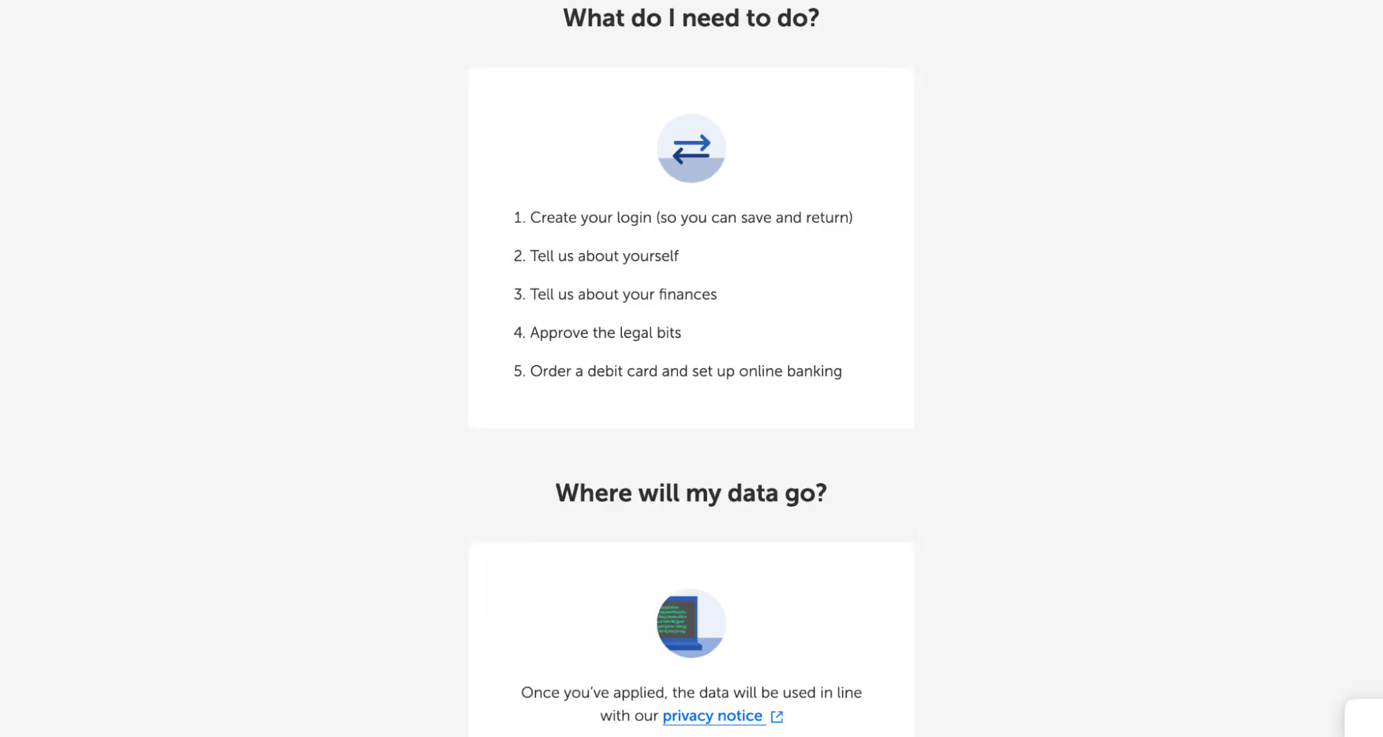
Even with all your best efforts to prepare people about the documents and time needed to complete an online application, life happens. Unexpected interruptions, like work calls or crying kids, can derail the process. That’s likely why Metro Bank starts its application process by asking people to provide an email address and password—something not all banks do. They also show a process bar to illustrate this is a multi-step process, so creating an account makes sense. Applicants can re-start where they left off. It also means that Metro Bank can send reminders to people who failed to complete the application.
Notice the password tooltip, which clarifies that the password is only for the application process and not the banking service itself.

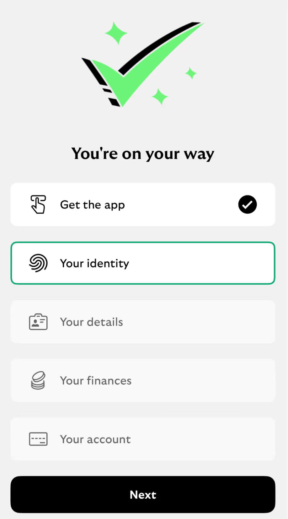
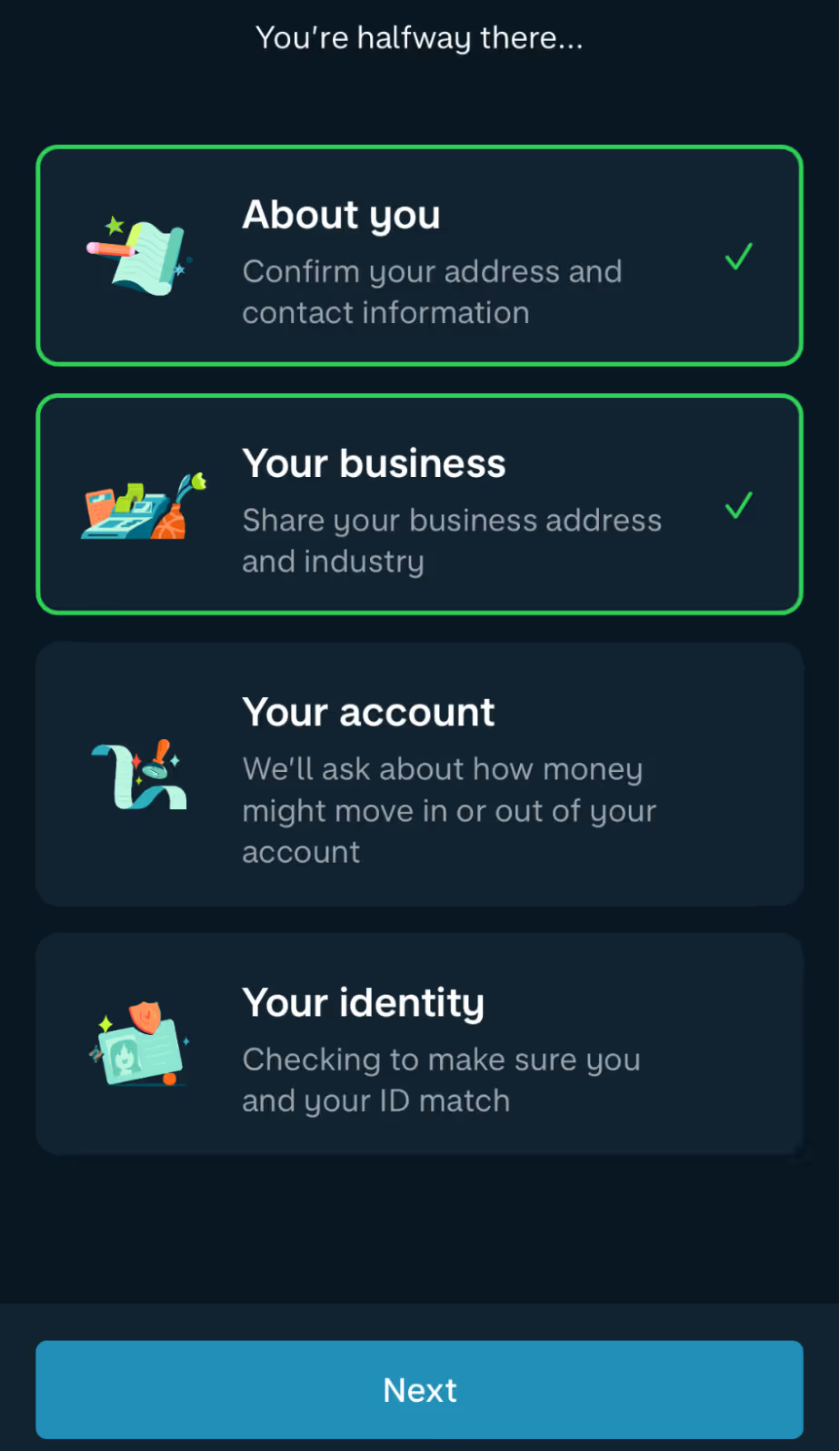
Showing how long the application might take can help manage expectations. Below are examples showing users what stages are involved and how far along they are, helping encourage people through the process. A shout-out to Monzo for the lovely microcopy, prompting users onward.

Are we nearly there yet?
It wasn’t that long ago when the only way to open a new bank account was to make an appointment, travel to a bank, fill out a lengthy application form, and provide your ID so photocopies could be made. Then, wait a few weeks for the physical card to arrive in the post before you can use your account. With such a long and winding process, there were many opportunities to drop out.
In contrast, opening a Revolut account can be done while waiting on a train platform commuting home. Download the app, record a selfie, and you can open a new account by the time the train arrives. It’s so fast it propels the user onwards without them even realizing.
Today, many banks use biometric technology for identity and KYC checks to speed up applications. However, how you present the process is critical; for many users, it will feel unfamiliar and potentially anxiety-inducing.
Chase does a great job explaining the process with clear design and copy in the example below for users who are unfamiliar with the process.
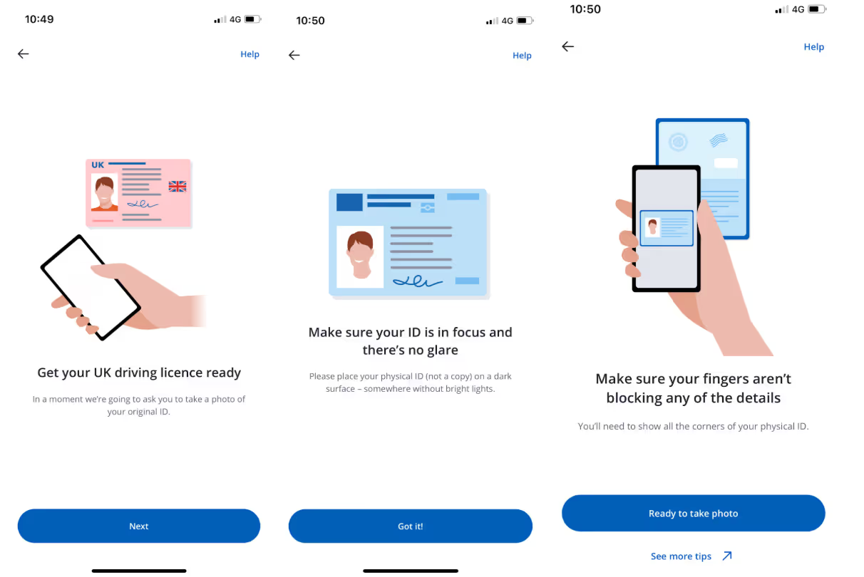
What happens if someone has problems and the biometric technology doesn't work for them? The first course of action should be to try to resolve the issue there and then via chatbots, tooltips, or phone assistance. If those are exhausted, you need to offer fallback options.
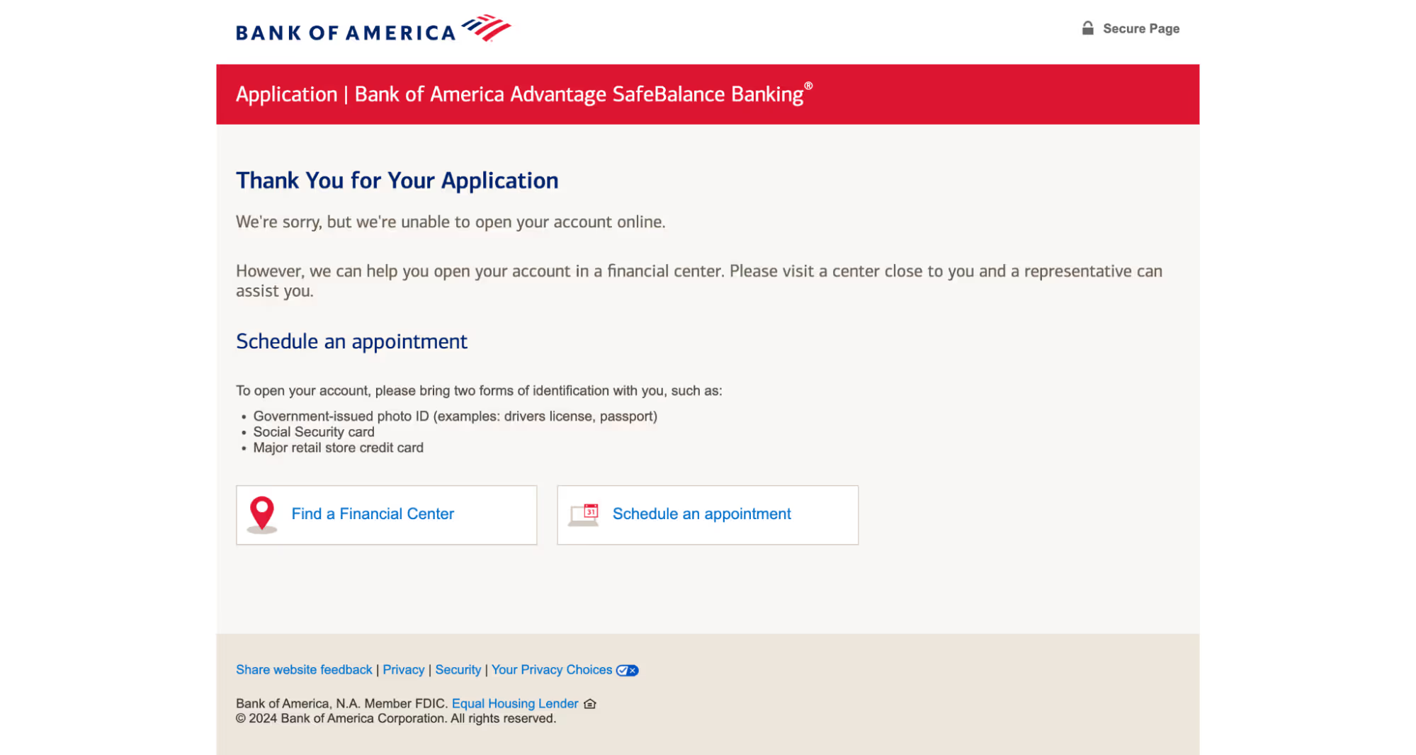
Bank of America offers those who have problems verifying their identity the option to schedule an in-person appointment when they realize they can’t complete the online process. This prevents people from dropping off, never to return when a problem occurs—as the user is offered a way to complete their task.
If you’re facing similar challenges with users getting distracted during online applications, here are potential ideas for A/B testing:
Pre-application preparation: Test whether a checklist of required documents, progress bars, and an estimated time to complete the application improves conversion rates. Save-and-resume options: Compare completion rates between flows that include save-and-resume functionality versus those that don’t.
Reminder nudges: Test email or SMS reminders for incomplete applications to see if gentle follow-ups encourage users to return and finish. Measure the completion rate of failed online applications when other options are provided.
Biometric KYC processes: Experiment with incorporating biometric technology to speed up KYC checks and evaluate user satisfaction.
These features could help keep users engaged and progressing in the application process. Once your new customers are onboarded, it’s time to make sure they feel safe and secure using your digital banking options.
Concerns about making online payments
Being tricked into sending money or giving access to a bank account is Americans’ second-highest scam concern, with 57% saying they frequently or occasionally worry about it happening to them. And with good reason—financial scams are among the most common crimes in the US last year.
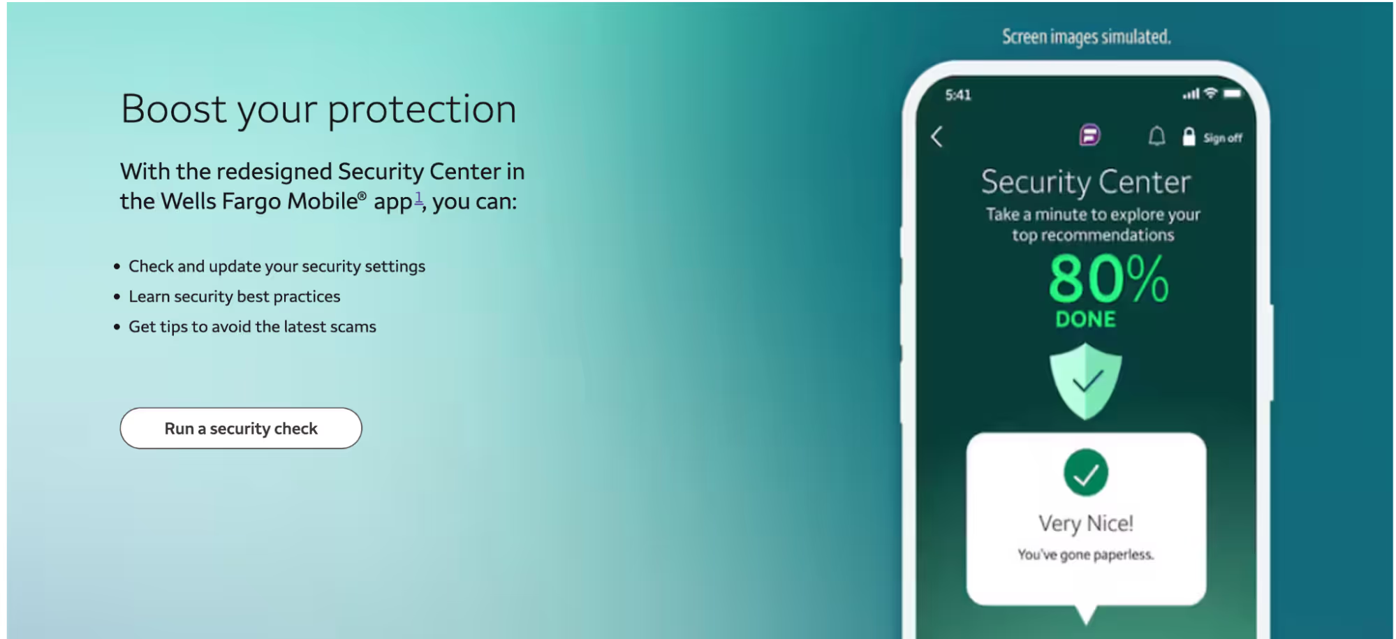
Wells Fargo has approached this problem by educating their customers. They offer a free "security check” to review accounts and offer information on how customers can protect themselves. Prevention is better than cure.
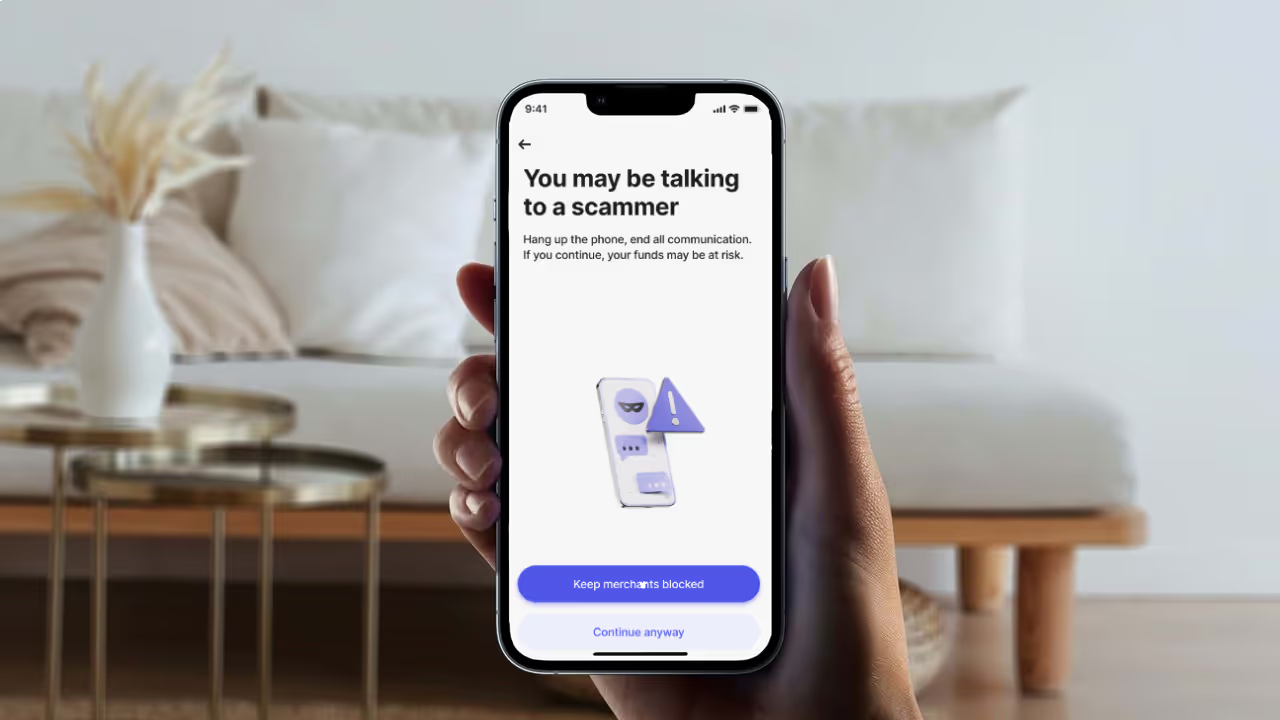
Recently, Revolut started testing an AI feature to stop customers from sending money to fraudsters. Since the launch, they’ve seen a 30% reduction in scam losses.
Revolut’s new feature evaluates the likelihood a card payment is part of a scam and, if considered high, declines the payment. The customer is then stopped from making similar payments and sent through an intervention process. During this stage, the customer must provide additional information and read educational stories illustrating how scammers work. This added friction helps give the customer time to think and asks them to confirm multiple times that they are sure. Revolut might still redirect the customer into a chat with a fraud specialist if they are concerned.
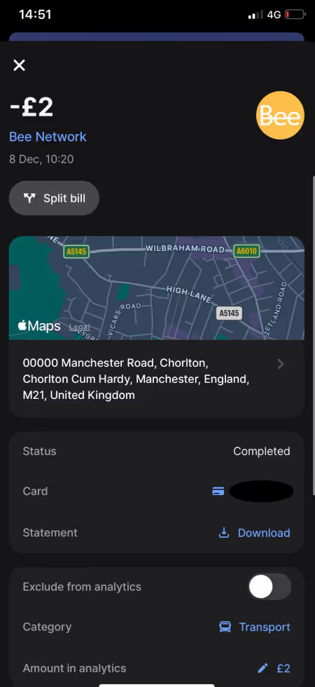
Before mobile banking apps, customers didn’t know they’d been scammed until they were told by their bank, had a payment declined, or received their monthly statement. Now, with mobile notifications, customers can see within seconds that money is being taken from their account and stop it. According to Built by Mars, the quickest average time for mobile payment notifications was Revolut, taking just 2.95 seconds to appear.
Not only is Revolut quick on notification, but it also provides additional information on transactions, including the company logo, name, and the location of the business on a map. In the past, I panicked when I couldn't recognize a business name, but the additional information helped me determine if the payment was genuine.
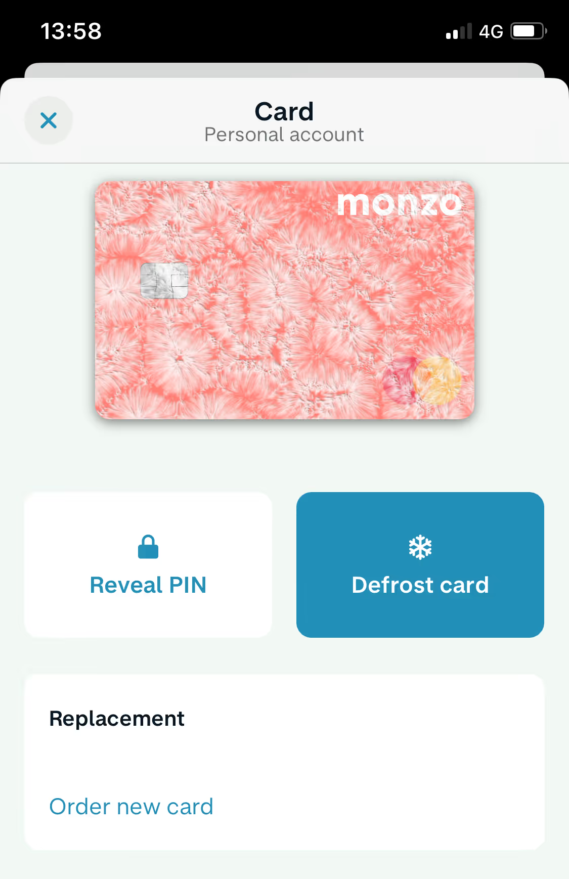
The ability for customers to block or “freeze” their cards is needed alongside transaction notification so fraudulent transactions can be stopped immediately. In the example below, Monzo also allows customers to “defrost” their card if they realize transactions were actually legitimate. There is no need to reorder a physical card if you made a mistake. This means if a customer is in doubt, they are more likely to pause transactions while figuring things out.
Even when customers make legitimate transactions, doing so can cause worry. Some banks check the payee’s name matches that associated with the account number, but ideally, we all want to be able to pay people, not account numbers. And now, we can.
I’ve seen a range of approaches to make payment much more user-friendly and less anxiety-inducing, including:
- Paying someone’s mobile number or national identity number.
- QR codes and personalized links.
- Paying to a username when using the same bank.
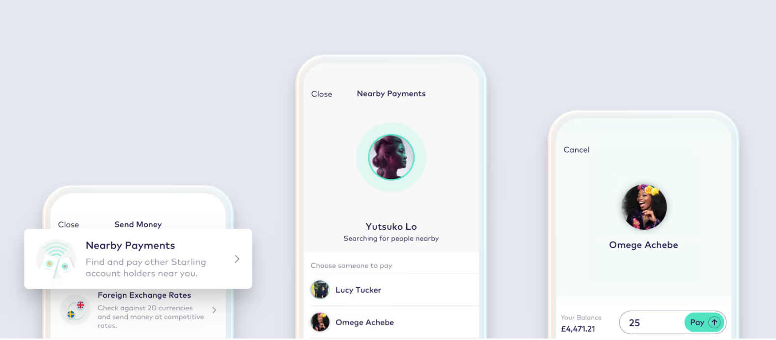
- Paying people “nearby” via Bluetooth.
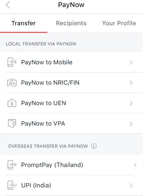
DBS Bank allows customers to pay using their national identity or cell phone number.
The above features may require significant time and resources to build. This is an ideal situation to deploy research and tests to assess whether the opportunity is worthwhile for the bank and the customer.
Solving common BFSI pain points through online banking tests
Addressing user pain points isn't just about staying competitive but meeting customer expectations for convenience, security, and clarity. The examples shared here highlight various ways to enhance user experiences, from guided product selectors to fraud prevention AI. Use these insights to spark your next hypothesis session, focusing on solving real customer frustrations. Don’t forget to check out how Kameleoon helps financial services capitalize on customer trust.
Now, it’s your turn to apply these lessons. What small changes could you test today to solve your customers' frustrations?


