How to create an effective call to action
Action buttons enable visitors to interact with your website: if they are interested in your brand, content, product or service, it’s the call-to-action (CTA), that enables them to take the next step.
Although CTAs might be small in size, they are an essential gateway to boost your conversion rates, and moving visitors down the sales funnel, which is why it’s vital that you optimize them.
1 What’s a call-to-action (CTA) and why should you optimize it?
A call-to-action is a button that can be placed on any page on your website or in an email. Its purpose is to prompt the visitor to take some kind of action (subscribe, download a resource, buy a product, share on social media, etc.).
A good call-to-action must:
- Be easily understood and persuasive
- Catch the visitor’s eye with its imagery
- Enable the visitor to take the action for which they came to the website
Several elements must be taken into account when optimizing CTAs, such as size, button color and wording, as well as the context in which they are displayed to visitors. This blog will review the essential points for optimizing your CTAs, helping drive an increase in conversions.
2 Creating the right context for your call-to-action
Before beginning any design or button text optimization, you need to think about the context in which your CTA appears: how do visitors get to this button and what do they gain from clicking it? How does it help the experience and move the viewer down the funnel?
A CALL-TO-ACTION THAT MEETS DIFFERENT VISITOR EXPECTATIONS
Visitors to your website don’t all have the same interests. And your main call to action, i.e. the action that is your brand’s main goal, won’t resonate with all of your target audience.
To increase your chances of converting your visitors, you can have several CTAs in place, to cater to different individuals’ expectations and interests and to increase conversion rates and clicks.
For instance, on e-commerce websites, you will often see a choice between: “Add to cart” or “Click & Collect” in checkout page design. This enables the brand to meet the needs of online shoppers looking to convert into customers and visitors who are just doing research before heading to a store.
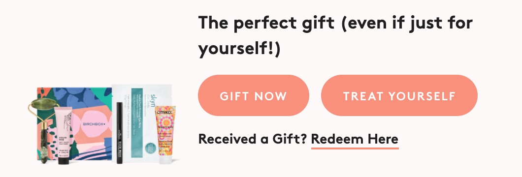
The beauty website Birchbox, for example, has identified two types of buyers, both with high conversion possibilities: those who are ordering products for themselves and those who are buying them as gifts. To immediately meet each visitor’s needs, two calls to action have been put in place: “Gift now” and “Treat yourself”.
For more about how to segment your audience and website traffic, and to address their particular needs then read our visitor segmentation guide.
If you are using several calls-to-action, as in this situation, then don’t hesitate to make the one that meets your business goals and increases conversions more prominent by using a different color, size or design.
Another aspect to consider is your users' demographics. Depending on location and culture, you might need to create international calls-to-action that appeal to them.
A CALL-TO-ACTION ADAPTED TO WHERE YOUR USERS ARE IN THE CONVERSION FUNNEL
You must tailor your offering to each visitor’s position in the buying cycle. After all, not all the visitors who come to your website are going to buy a product or subscribe to a service on their first visit. They could simply land on a page by arriving from a search engine or paid search. Nonetheless, you must help potential customers move along your conversion funnel. Personalization is key to this - as explained in our guide and in more detail later in this post.
That means you need to provide experiences adapted to all visitors so that they will eventually want to convert online.
A CALL-TO-ACTION ADAPTED TO THE CHANNEL USED BY VISITORS
According to research from Salesforce, 60% of internet traffic comes from the mobile channel: it is therefore crucial to optimize your CTA so that it is clickable and effective on all devices. You can also implement special CTAs for mobile users, such as ‘call’ CTAs. With a simple click, the number is dialed from the cell phone, thus increasing conversions.
3 Call-to-action (CTA) design and placement
WHERE TO PUT THE CALL-TO-ACTION ON YOUR PAGE
The goal is for your CTAs to be clicked. For this to happen, you must place them where the visitor is most likely to take the desired action.
What works best in terms of position to boost conversions is an ongoing debate. It is often claimed that the best position on the page for your important elements is above the fold (i.e. the part that is visible without scrolling). However, it’s not as simple as that - if the visitor already knows your brand, and arrives on your landing page, they are likely to click directly on the CTA at the top of the page.
New visitors, on the other hand, will require more information before clicking on the CTA, and they will look for it by scrolling down the page.
That means that the best location for your CTA placement depends on your website conversion goals and the experience you want to provide for your visitors. Here are some examples to inspire you:
1. The call-to-action is placed to be immediately visible when the visitor arrives on the website
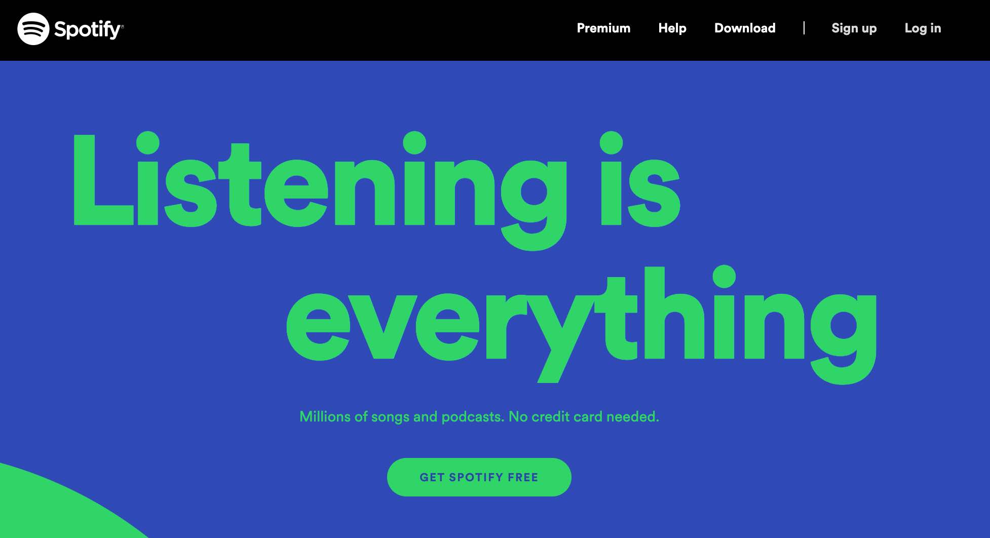
The CTA inviting visitors to download a free version is immediately visible at the top of the page, near the header, and there is no possibility of scrolling. Here, the brand feels that visitors don’t need any additional information before engaging and becoming subscribers.
2. The call-to-action is visible at all times as you scroll (sticky CTA)
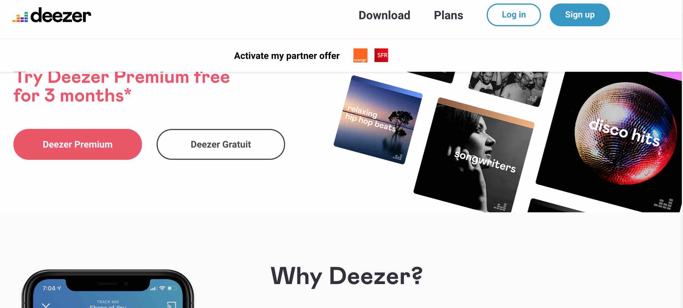
As on many websites, the CTA is in the menu bar, which remains visible as you scroll. To make the CTA more visible, sometimes its color changes when the visitor scrolls down the page.
This approach is a compromise between the two previous methods. The visitor can find out more about the service and move to the next stage whenever they want.
WHAT COLOR SHOULD YOUR CALL-TO-ACTION BE?
No one color works better than another. The challenge is to find a color that is in harmony with the visual hierarchy of your website, but contrasts with the surrounding elements so that the CTA is noticeable at first glance.
Apart from these considerations, the only way of knowing whether one color works better than another is to run an A/B test. Let’s take the example of Younited Credit, which tested three different colors for its CTA enabling visitors to ask for a loan.
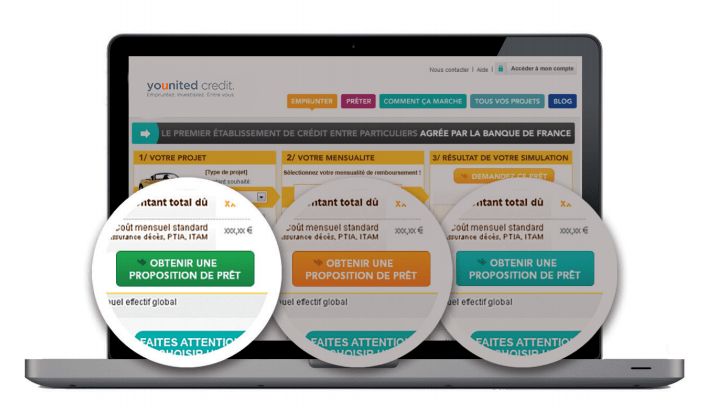
The A/B test revealed that the green CTA generated the most conversions, with a 6.82% increase in the click rate. This wouldn’t have been immediately obvious, demonstrating the importance of testing.
Find out more about testing and its importance to conversion optimization in our What is A/B testing? resource page.
SHOULD YOU USE AN IMAGE FOR YOUR CALL-TO-ACTION?
It’s possible to make images into CTAs. This is used particularly on some fashion websites.

With this approach, you can provide visitors with a preview and encourage them to click to see the rest of the page. Adding a zoom effect shows that the area is clickable as an action button.
Use images wisely and always remember to keep them linked to the visual hierarchy of your website. If you spread image CTAs across your page, they will no longer stand out. Not only will they not be clicked on, but visitors might mistake them for simple images.
Good to know: on average, image CTAs convert two times less than button CTAs according to HubSpot research. The image must be really relevant to your website and to understanding your CTA - otherwise, go for a classic version instead.
WHAT SIZE SHOULD YOUR CALL-TO-ACTION BE?
If you want your CTA to be seen and understood by visitors to your page, you must ensure that it’s large enough. In fact, the bigger your CTA is, the more it will be noticed and the easier it is to click, helping you to boost conversions.
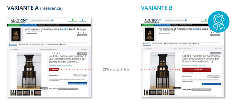
However, your CTA must fit in with the design of your page and it shouldn’t annoy visitors. It should be part of the user experience and match your value proposition and marketing campaigns. Let’s take the example of the Auction brand, which used an A/B test to optimize the CTA on its product information pages.
On the original version, the CTA was very small: the button copy was hard to read and the CTA was lost among the wealth of information featured on the product information page. With a larger size, the CTA is clearly identifiable and visitors make 38.4% more bids.
A CALL-TO-ACTION THAT LOOKS LIKE A BUTTON
Make sure that your button looks like… a button!
It may seem obvious but if your button doesn’t look clickable, it’s not doing its job. For example, you can make your button change color when a user mouses over it, improving the click through rate.
4 Choosing relevant wording for your call-to-action
WHAT MESSAGE SHOULD YOUR CALL-TO-ACTION COMMUNICATE?
The wording of your CTA should be crystal-clear. The visitor must immediately understand why they are going to click and what will happen next from your copywriting. Do they want to download a resource? Sign up? Request a demo? Make an appointment?
To easily decide on the wording for your CTA, put yourself in your visitors’ shoes and complete the sentence “I want to… “:
- Download an ebook
- Sign up now
- Request a demo
- Make an appointment
Avoid generic terms like “Find out more”, “Click here”, “View”, “Buy”, etc. They may well correspond to the action expected from the visitor, but they are completely overused online and far too impersonal. Stand out with something more original that uses action words to convert customers.
HOW SHOULD YOU ADDRESS YOUR WEBSITE VISITORS?
Your CTA must be enticing, grab your visitors’ attention and encourage them to stay on your website. To do this, you must give the visitor control of the process:
- Speak to the visitor directly or put yourself in their shoes: “Access your/my benefits” or “Download your/my ebook”.
- Use action verbs: “Start”, “Request”, “Download”.
- Play on the sense of urgency: “Now”, “From today”, “Immediately”.
By using these words in your CTA, you make the visitor the main actor on your page and encourage them to convert.
5 Personalize your calls-to-action
Taking it further, you can adopt a real-time personalization strategy by using visitor data, such as where they have come from, the device they are using or their interests.
As part of your conversion strategy you can personalize your CTA according to a wide range of criteria. Here are some examples:
PERSONALIZE YOUR CALLS-TO-ACTION BASED ON GENDER
This type of personalization is often used on clothing websites so users can directly access the style that suits them.
So, when visitors arrive on your home page, they might see the image CTA of a woman or a man at the top of the page, helping focus their browsing.
PERSONALIZE YOUR CALLS-TO-ACTION BASED ON GEOLOCATION
By using the location of your visitors, you can display CTAs that are able to tailor the online experience optimized to the visitor’s actual needs.
You can test personalized CTAs to facilitate visitors’ cross-channel experience and increase sales: “Find a store in New York”, “Delivery to St Louis in 48 hours”, “Test-drive this car in San Diego.”
PERSONALIZE YOUR CALLS-TO-ACTION BASED ON SOURCE
By identifying where your visitor came from before arriving on your website, you can personalize the CTA so that the experience is consistent from start to finish, generating leads and improving conversion rates.
For example, if you identify that a visitor comes to your website via an advert, you can display a CTA for them that corresponds to the messaging in the ad. Or if a visitor arrives via a keyword search on a search engine, you can display a CTA to them that is linked to their search, helping convert traffic.
PERSONALIZE YOUR CALLS-TO-ACTION BASED ON PROGRESS ALONG THE CONVERSION FUNNEL
Visitors don’t all have the same maturity level, so they are not all ready to take the same actions. Instead of giving visitors several choices, you can implement CTAs that change depending on the visitor’s relationship with the brand.
For example, you can display an initial CTA that invites visitors to download free content with a sign up form. Then, once this action has been taken, the CTA could invite visitors to download premium content or request a demo.
6 Always remember to A/B test your calls-to-action!
For CTAs, just as for all the other elements of your website, there are no evergreen best practices or tactics. After all, web users’ habits evolve, as does the context, and this can make your CTA obsolete even if it was working perfectly until now.
Ideally, you should regularly use A/B tests to compare new alternatives to your existing CTAs. This will demonstrate, with actual, reliable data, what changes you can make to your website to increase your conversion rate, by identifying the best converting designs.
As a marketer you invest heavily in driving traffic to your website. If you then fail to put in place an effective conversion strategy all of the efforts of your marketing campaigns will be wasted.
Therefore take a strategic approach to conversion rate optimization, using a strong call to action at the right time to encourage visitors to move forward in the customer journey, driving digital growth and greater revenues. Therefore take a strategic approach to conversion rate optimization, using a strong call to action at the right time to encourage visitors to move forward in the customer journey, driving conversions and greater revenues.


