
Telehealth without the headache: UX approaches that improve patient experiences

The adoption of telemedicine surged during COVID-19, and its place in modern medicine has solidified. Last year, an estimated 1.3 billion people used digital health solutions, including fitness trackers, smartwatches, and telehealth.
Good digital healthcare experiences must cater to a broad spectrum of users and needs, from a parent looking for details of the nearest ER while soothing a crying baby to an elderly patient scheduling a routine appointment. All too often, however, patients encounter complex information, convoluted user journeys, and forms that all but require a medical degree to complete.
Kameleoon’s latest research underscores this challenge: only 3% of healthcare organizations consider themselves clear leaders in their industry—the lowest of all sectors surveyed—and just 17% expect significant growth in the year ahead, compared to 53% of SaaS companies.
For healthcare organizations, this gap represents more than lost revenue. Every friction point risks eroding patient trust, which in turn can delay care or discourage someone from seeking help altogether. The good news? Healthcare providers investing in experimentation across product, marketing, and engineering teams are setting themselves apart. By continuously optimizing every digital touchpoint, they deliver care experiences that guide, reassure, and remove barriers for patients in need.
This article examines real-world examples of healthcare providers getting it right—where thoughtful design, rigorous testing, and patient-centered thinking have transformed digital interactions into fast, effective experiences.
- The patient journey
- Medical language
- Matching user wants & needs with the correct physician
- Guiding patients through complex insurance requirements
- Appointment booking
- What the best healthcare providers get right
Digital healthcare must consider the entire patient journey
Healthcare is no longer confined to hospitals and clinics. Virtual doctor appointments and wearable technology enable preventative care, monitoring, and treatment at home. Smart fabrics track vital signs, while patches and implants can automatically run tests and deliver medicine. Diagnostic kits, mailed directly to patients, allow them to complete tests independently. While these enhancements allow greater accessibility and control for patients, they require digital teams to build continuity across complex patient journeys.
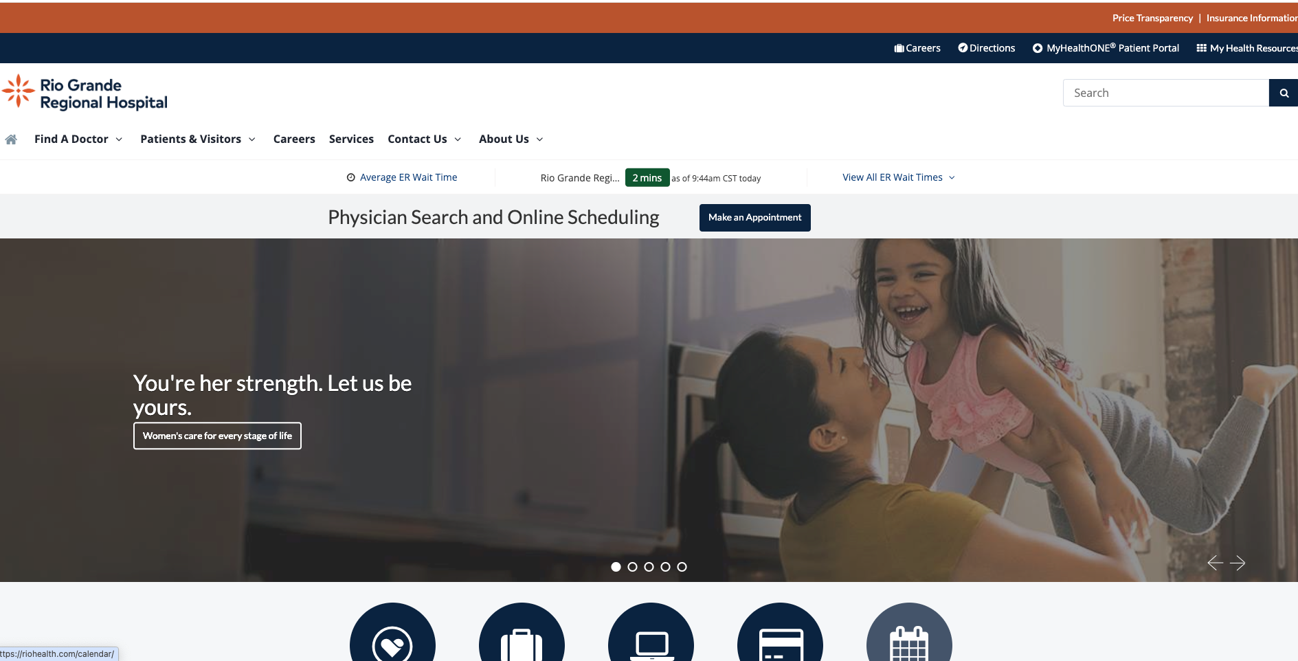
Rather than improving experiences or pages in isolation, digital teams must consider where in the journey the patient is and what their specific wants and needs are at that stage and the next. Take Rio Grande Regional Hospital’s website. A simple-yet-effective banner displays real-time ER wait times across hospitals on their homepage. This directs patients to locations with shorter wait times to access emergency care faster. It’s a small but powerful example of how UX can reduce friction and improve patient outcomes by thinking about the whole journey.
A good digital healthcare experience personalizes future interactions across touchpoints from the first enquiry. By asking, for example, whether a user can take phone calls or requires an accessible alternative, they ensure communication methods are tailored to individual needs, removing barriers before they arise.
Experimentation teams should map common patient journeys and conduct user research to identify friction as people move between touchpoints. A/B tests can help determine the design, layout, or information that best reduces that friction. Experiments could also help test different approaches, such as live chat versus forms or telephone calls, to measure their impact on patient experience.
Speak human, not jargon
Some healthcare websites expect patients to use medical terms to proceed through the digital journey. This might work for a few knowledgeable users, but for the majority, it’s not just inconvenient; it’s a barrier to care.
This is why it is so important for users to be able to describe symptoms in everyday terms, analyzing the input to suggest potential matches with medical terms or specialist departments. This functionality supports triage efforts, helping direct patients to the right specialist before a follow-up call. Experimentation teams can perform feature testing on variations of symptom-based search modules, such as structured dropdowns vs. free-text entry, and try AI and machine learning features to reveal which approach leads to more accurate and faster triage.
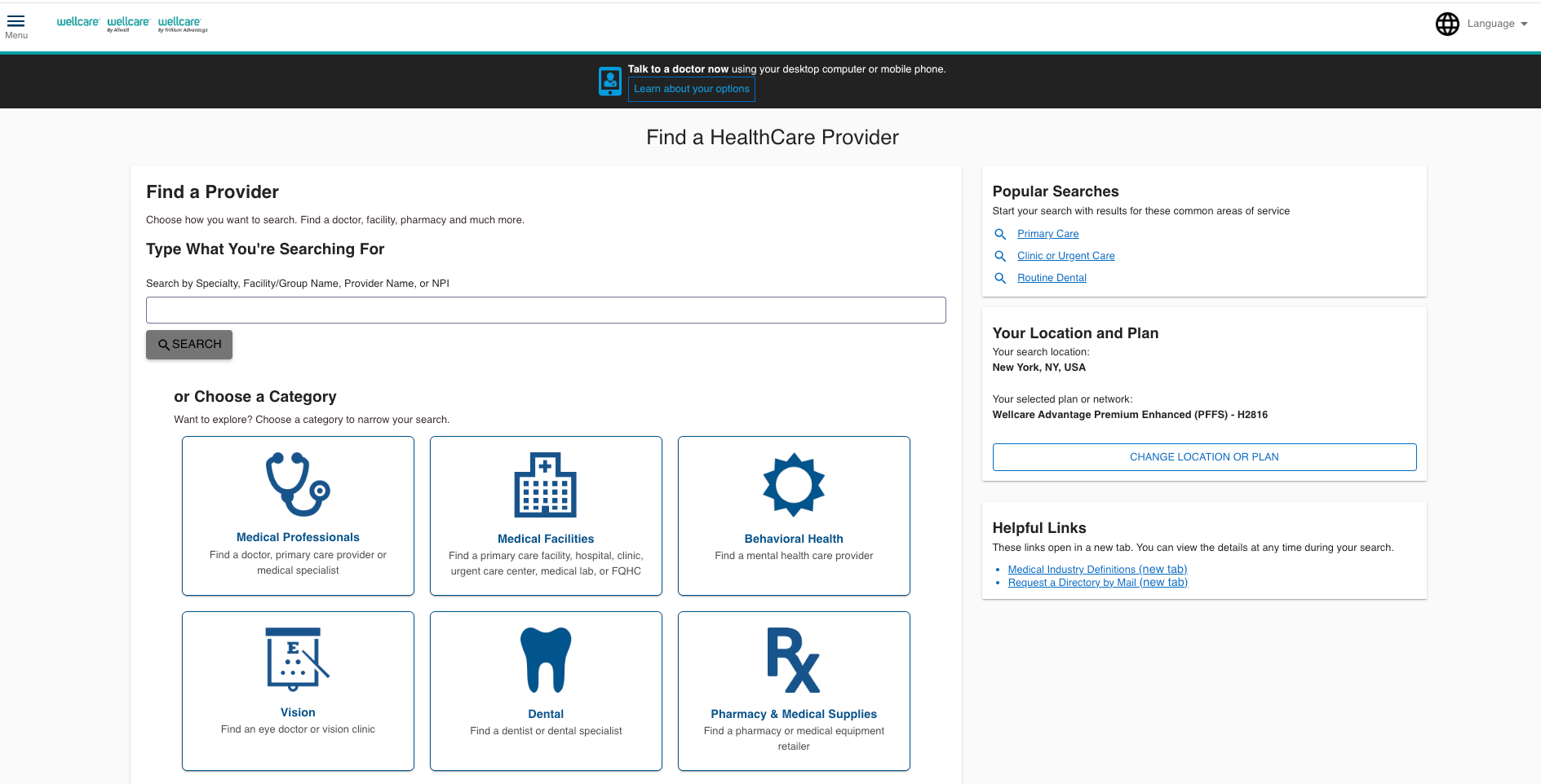
Confusion also arises when patients are asked what type of physician they need. Do you know the difference between a cardiologist and an endocrinologist? Wellcare combats this issue by offering structured help. Instead of expecting users to know what type of doctor they need, the site provides "popular searches" as examples of doctors patients can search for, e.g., primary care or routine dental. However, these still might not be clear enough, so Wellcare offers broad categories like “dental” or “behavioral health” with additional explanations. For example, selecting "Primary Care" reveals additional subcategories to narrow the options until the user finds the right one. By guiding patients through the process, Wellcare ensures they can confidently book the right care.

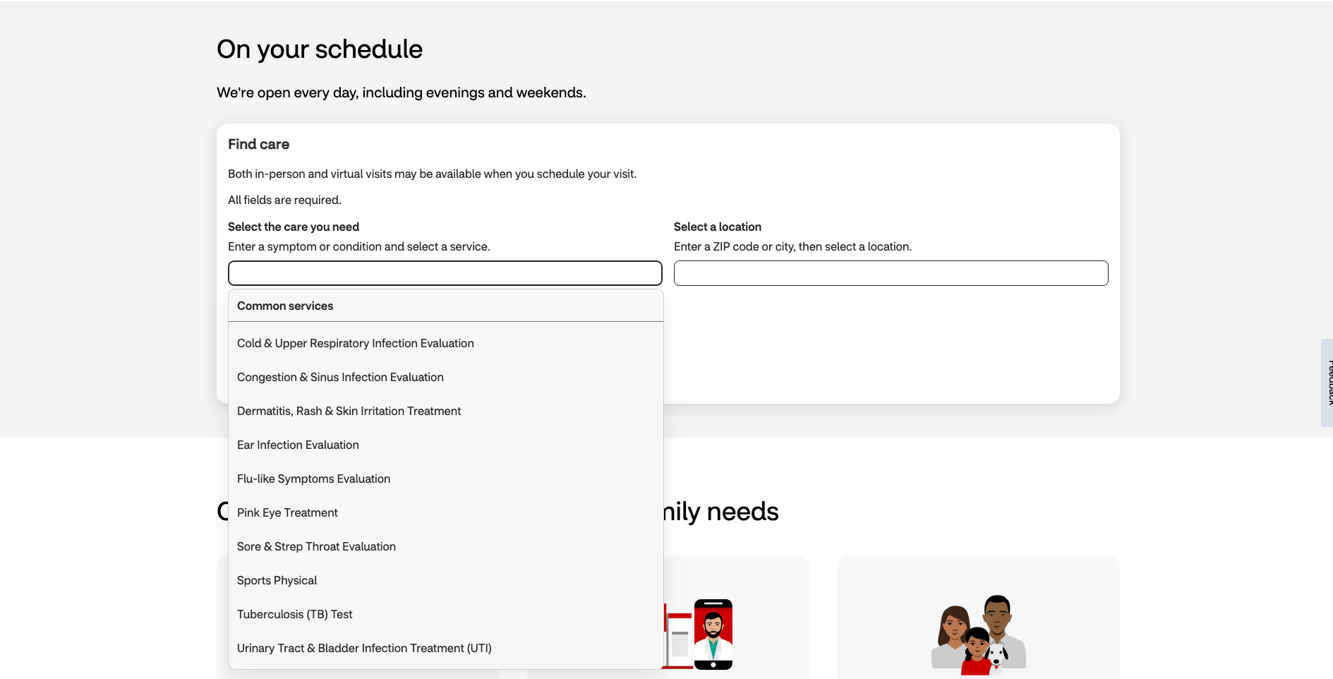
CVS’s MinuteClinic takes a different approach by providing a drop-down of common illnesses and symptoms directly into the search box. Instead of relying solely on medical terminology, it uses clear, everyday language, such as “sore and strep throat,” rather than clinical terms, making it easier for users to find the right care.
Experimentation teams can utilize web and feature experimentation to test different ways of surfacing medical specialists, such as predictive suggestions, guided wizards, or interactive symptom checkers, to determine which option helps improve accuracy and appointment bookings.
Matching user wants & needs with the correct physician
After selecting the type of medical professional required, patients are often shown a long list of doctors, which can lead to choice paralysis.
While key details such as doctor experience, availability, insurance coverage, credentials, languages spoken, and patient testimonials can help guide decision-making, additional assistance is often required to help users make a choice.
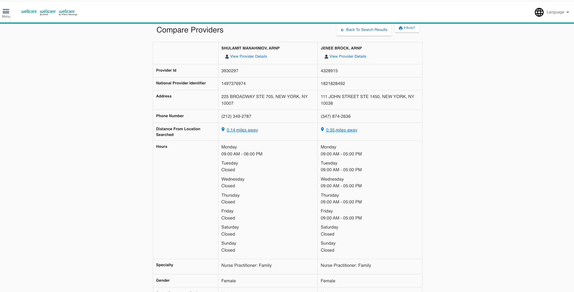
Wellcare enhances the provider selection process by allowing users to compare physicians side by side, offering a straightforward way to evaluate multiple options before making a choice.
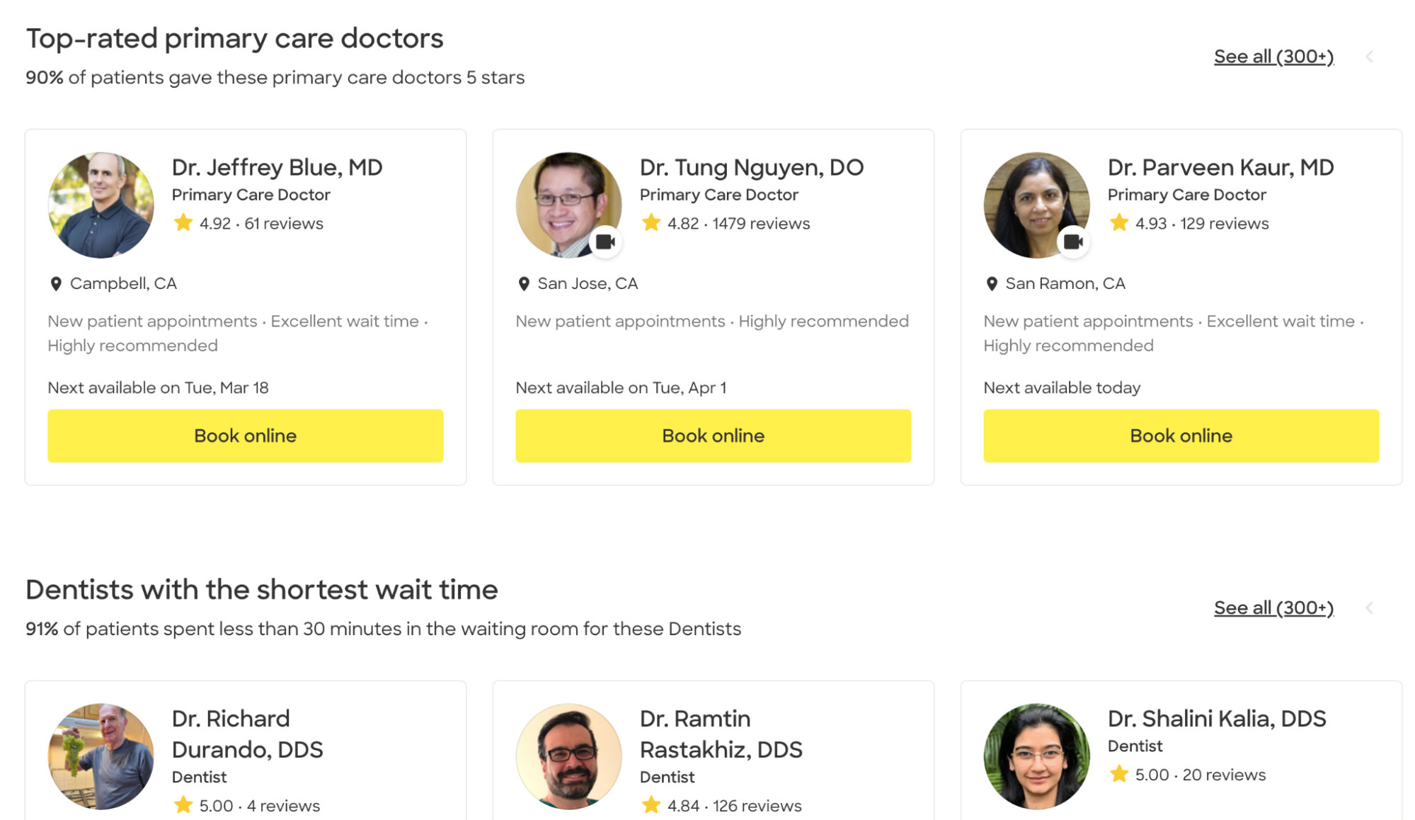
Zocdoc allows patients to bypass the search process by featuring “top-rated” lists from the homepage, highlighting categories such as “dentists with the shortest wait times.” This approach reduces cognitive load by eliminating the need to look through results, instead offering pre-vetted options based on common user wants. A/B testing placement, wording, and ranking logic for these lists could help optimize the experience by surfacing the most suitable providers.
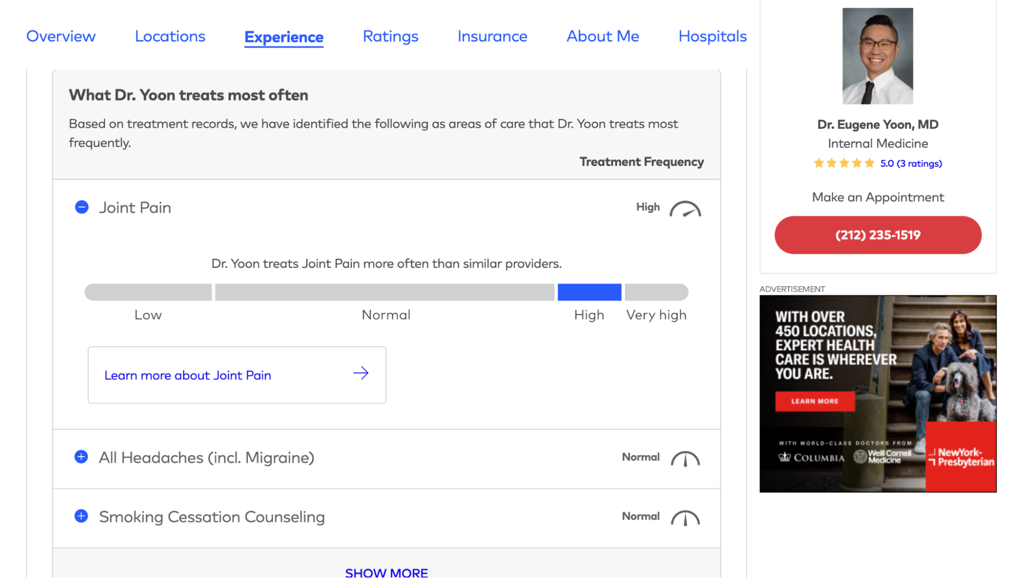
Healthgrades prompts users to input their condition or procedure and then shows how experienced the provider is with that condition. This functionality cleverly uses data to answer patient concerns over a doctor's experience by taking complex information and making it digestible.
Similarly, Healthgrades's "Top Care Area" ranking presents the most common conditions treated by each provider, offering information that other healthcare sites neglect. These rankings are made more trustworthy and objective by the information presented. Each ranking includes percentile comparisons against peers based on nationwide billing claim data. The use of confidence intervals—80%, 90%, and 95%—helps instill trust by demonstrating the reliability of the data, reducing uncertainty, and allowing users to feel more confident in their choices.
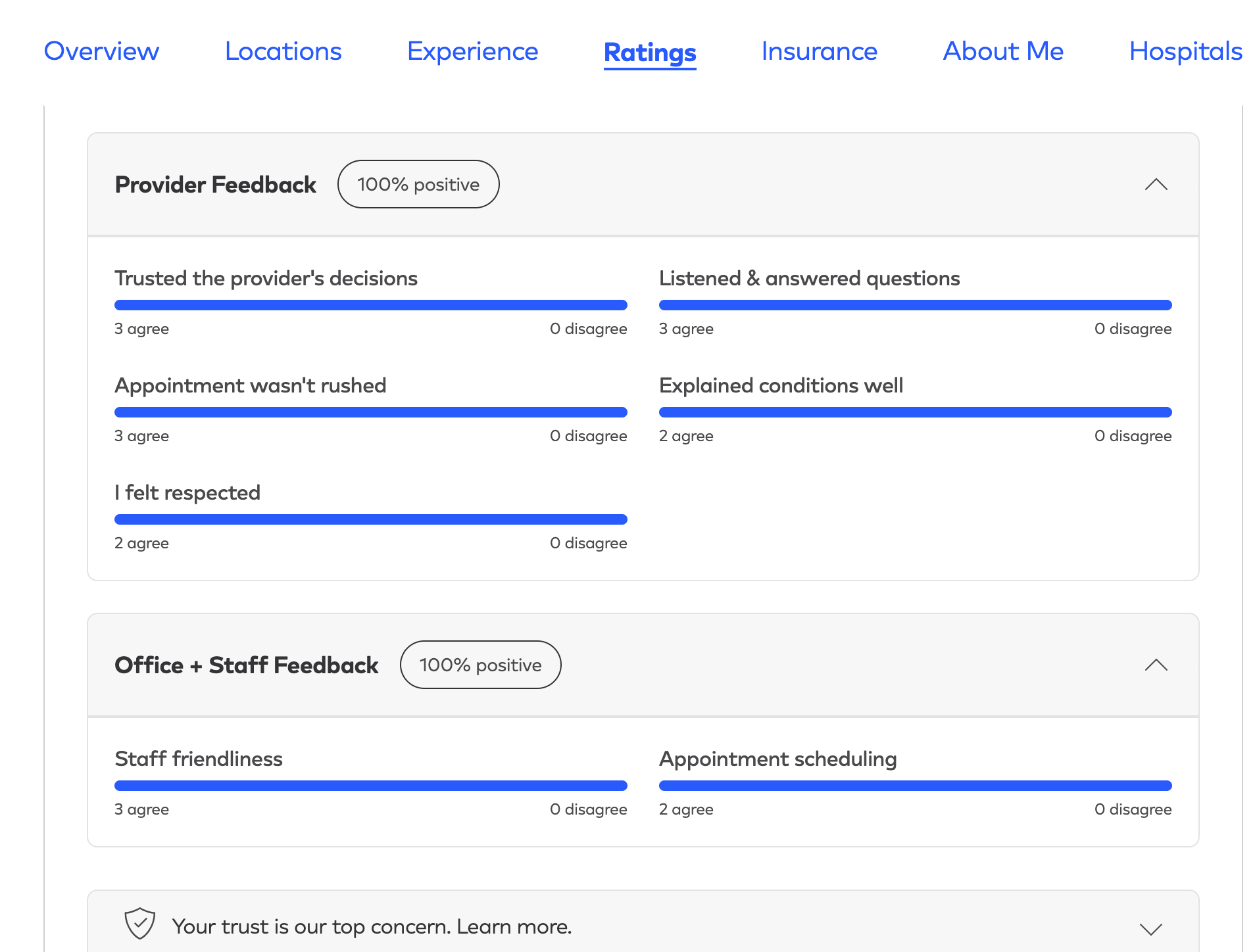
A five-star rating, while helpful, lacks nuance. If multiple providers have the same score, how can patients determine which fits their needs best? Adding social proof through patient reviews can help users differentiate between options. Still, lengthy, unstructured text can make extracting meaning or getting an overall view difficult.
Healthgrades addresses this using review summarization and visuals to reduce the cognitive load. Instead of forcing patients to sift through individual testimonials, Healthgrades distills common themes from patient feedback and presents it in an easy-to-scan format. Attributes such as whether patients felt listened to or trusted their provider’s decisions are visually represented through “agree” or “disagree” charts.
This design uses progressive disclosure, ensuring users start by seeing the most relevant information first but can still delve into full reviews later. This approach transforms subjective experiences into structured, comparable data, helping users find a highly rated provider that aligns with their priorities.
Guiding patients through complex insurance requirements
Nothing derails a patient experience faster than realizing, after 10 minutes of filling out forms, that their chosen doctor is out of network.
Healthcare and insurance are complex enough on their own—combined, they can become an obstacle to care. Patients who struggle to understand coverage details may delay or even forgo treatment. Therefore, a key challenge for healthcare providers is making it easy for users to find in-network doctors and facilities without making the experience overly complex.
Northwell Health prompts users to enter their insurance provider at the start of their search, ensuring every result shown is covered by insurance. This prevents wasted effort, and the disappointment of discovering a selected provider isn’t in-network.

For visitors who don’t filter by insurance upfront, the experience shouldn’t be a dead-end if their chosen doctor isn’t covered by insurance. Instead of forcing users to start over, Healthgrades helps users pivot, using their insurance details to refine the search. Keeping the user’s journey intact reduces the likelihood of a user abandoning the experience in frustration.
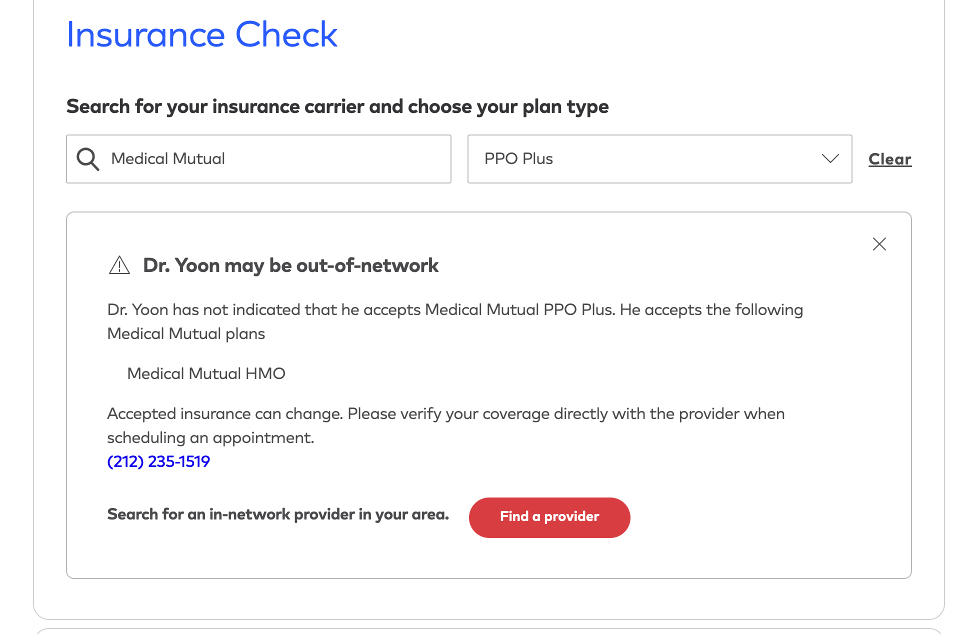
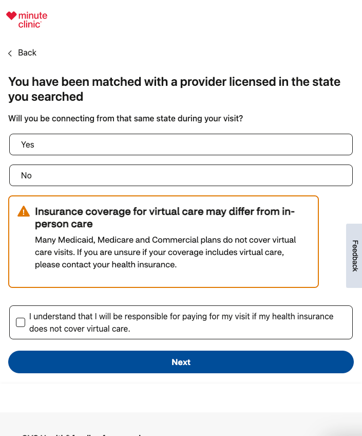
MinuteClinic anticipates coverage gaps for virtual appointments and proactively informs users before they proceed. It clearly outlines which providers might not cover telehealth consultations. MinuteClinic suggests clear next steps for those unsure about their coverage, preventing confusion and helping users make informed decisions before booking.
This is a good opportunity for A/B testing in healthcare; teams can test alternative placements of the insurance filter—before, during, or after search—to determine where it has the highest engagement and lowest abandonment rates. There’s also an opportunity to test different messaging styles, such as alerts, tooltips, or inline explanations, to reveal which format prevents billing issues and improves transparency.
Easy appointment booking
When it comes to scheduling healthcare appointments, simplicity and clarity are essential. Appointment reminders and rescheduling are expected as given—without requiring a phone call.
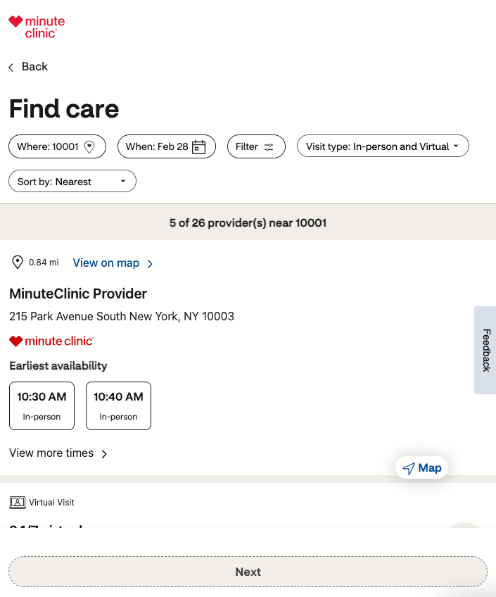
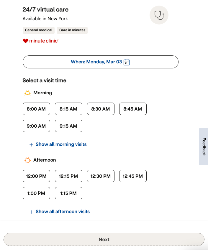
MinuteClinic’s appointment booking page exemplifies this approach with a clean, intuitive design. By defaulting to the nearest available location, the website reduces user effort while allowing patients to refine their search through filters. A map view provides spatial context, and the earliest available slots are prominently displayed, helping users quickly find a time that fits their schedule.
To further enhance usability, time slots incorporate visual time-of-day icons, making it easier for users to scan and compare options at a glance.
Remember that patients might be unfamiliar with the technology and software needed for virtual appointments, so provide any requirements in easy-to-understand language.

Testing different appointment layouts, such as list views vs. calendar or map views, can determine which format leads to higher booking rates, while testing appointment reminder channels and cadence can help lower missed or canceled appointments.
What the best healthcare providers get right
The best digital healthcare experiences remove complexity. From guiding users through symptom identification to simplifying provider selection and insurance verification, the strongest platforms anticipate pain points and eliminate friction at every step.
Furthermore, they ensure every test is rigorous, compliant, and continuously validated. Leading organizations leverage Bayesian statistics, sequential testing, and CUPED-based variance reduction reduction to get reliable results faster. AI-driven optimizations, like symptom checkers, triage models, or predictive provider recommendations, undergo continuous experimentation to ensure they remain bias-free and effective.
The investment pays off too; Kameleoon research shows that 50% of experimentation leaders expect significant growth in the next 12 months, compared to just 31% of product-led teams. For healthcare providers, unified experimentation isn’t just a best practice—it’s a growth driver.
Clarity, accessibility, and user-centered design don’t just improve engagement; they directly impact patient outcomes. All teams have roles to play in refining these interactions—the providers leading the way in digital healthcare are the ones who are unifying web, feature, and backend experimentation to build a more data-driven, patient-centered future.


