Kameleoon has a brand new look and reporting features
At Kameleoon, we're constantly optimizing our platform. Like you, we carefully analyze how our customers use our platform and test optimizations to ensure it's helping users easily create A/B tests and personalizations—both client and server side.
Today, we’re releasing a brand new UX for Kameleoon called HORIZON, along with many new features.
Our goal with HORIZON? To make A/B and full stack testing, feature management and personalization as intuitive as possible, regardless of the device, so users of any experience level can easily create and manage their optimization and personalization work.
Here’s a look at what the brand new Kameleoon interface offers.
1 Faster display and easier management of A/B tests and personalization campaigns
HORIZON is designed to give better and faster access to all their A/B testing and personalization campaigns.
We’ve eliminated elements that could delay the loading of your pages and we better organized menu options. Now, the interface not only displays the information you need most, but your campaign management pages load even faster.
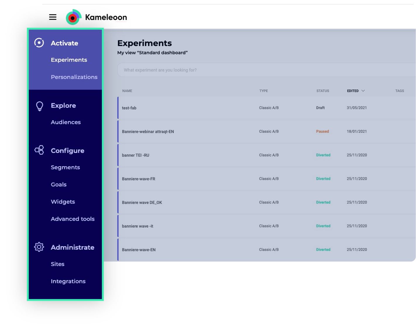
The main menu is faster and simpler
To make campaign management easier, and to allow you to access any page quickly, HORIZON delivers a simplified navigation.
In the main menu, you will find 4 sections:
- “Activate” to set up your campaigns
- “Explore” to analyze your data
- “Configure” to set up all the elements used in your campaigns (segments, KPIs, etc.)
- “Admin” to install the platform and integrate Kameleoon with your martech
The dashboard displays more a/b tests, feature flags, and personalization campaign data
The new dashboard allows users to more easily see and manage all of their campaigns:
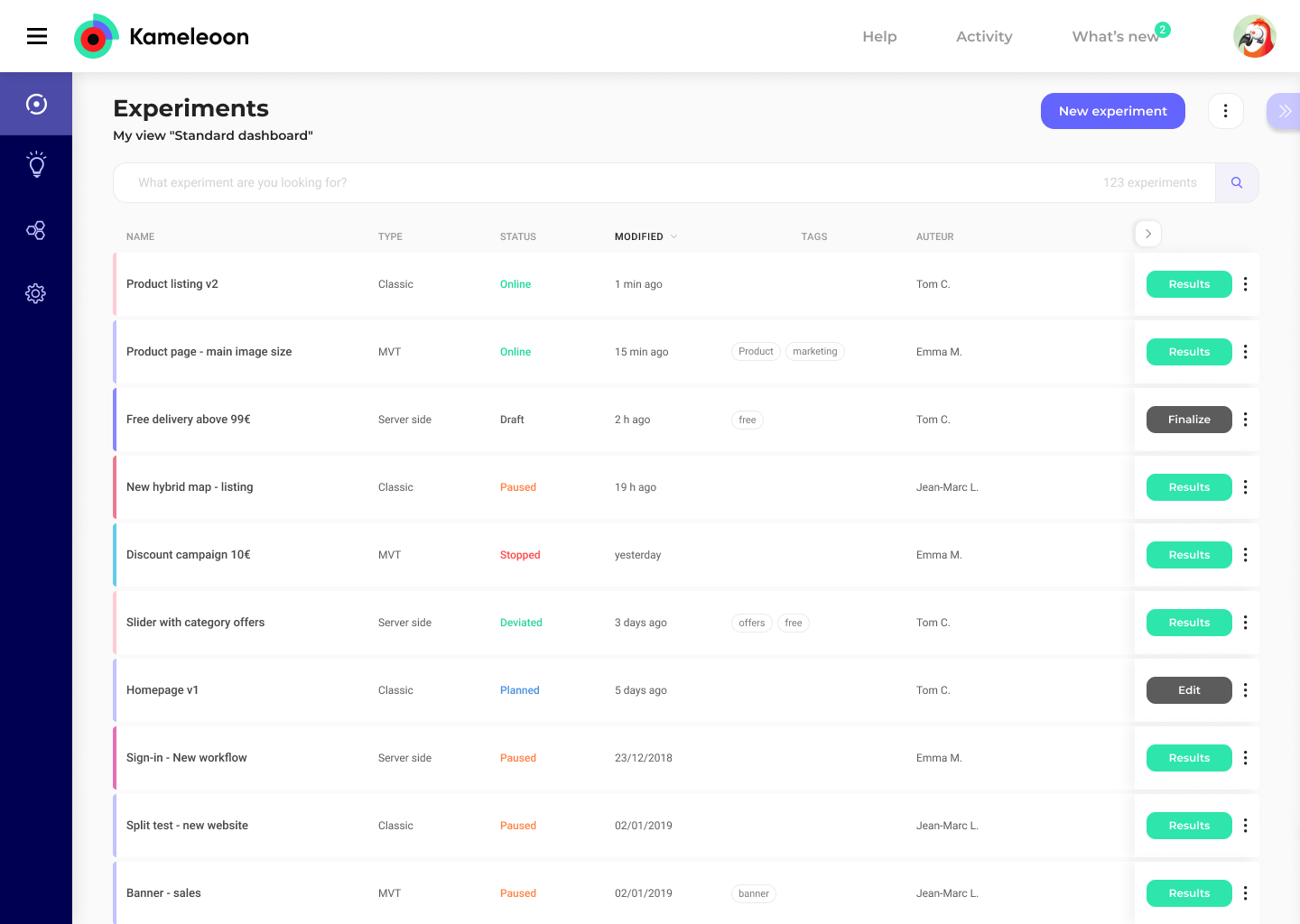
Twice as many A/B tests and personalization campaigns are “above the fold.” By moving to a list format, your dashboard now displays twice as many tests and reduces the need to scroll to find your latest work. Want to see more? Scroll right for additional columns.
Your campaign names are now fully visible. No more truncated titles—you can identify your experiments at a glance.
The tags you assign to your campaigns are easier to find. Easily find and filter campaigns in your dashboard based on your tags.
The search bar is bigger and more prominent. Plus, we’ve tweaked our search algorithms so finding your campaigns is that much smoother.
You can sort your dashboard by date, status, creator, and title. Click on the column heading and you’ll see all your work in a sorted, ordered way.
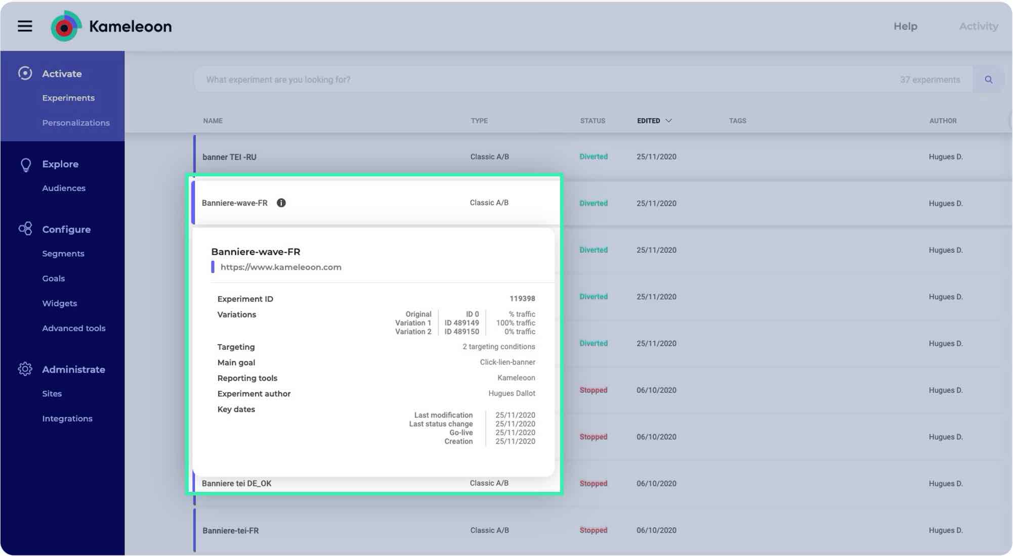
Hover to see more data about your campaign. For quick reference, hovering over any A/B test, feature flag or personalization allows you to see more metadata associated with the campaign.
Analytics at a glance. Previously, some performance analytics data loaded inside of your campaign card. Now, a brand new analytics page—dedicated to the entire performance of your campaign‚will feature the improvement percentage of the winning variant (plus much, much more).
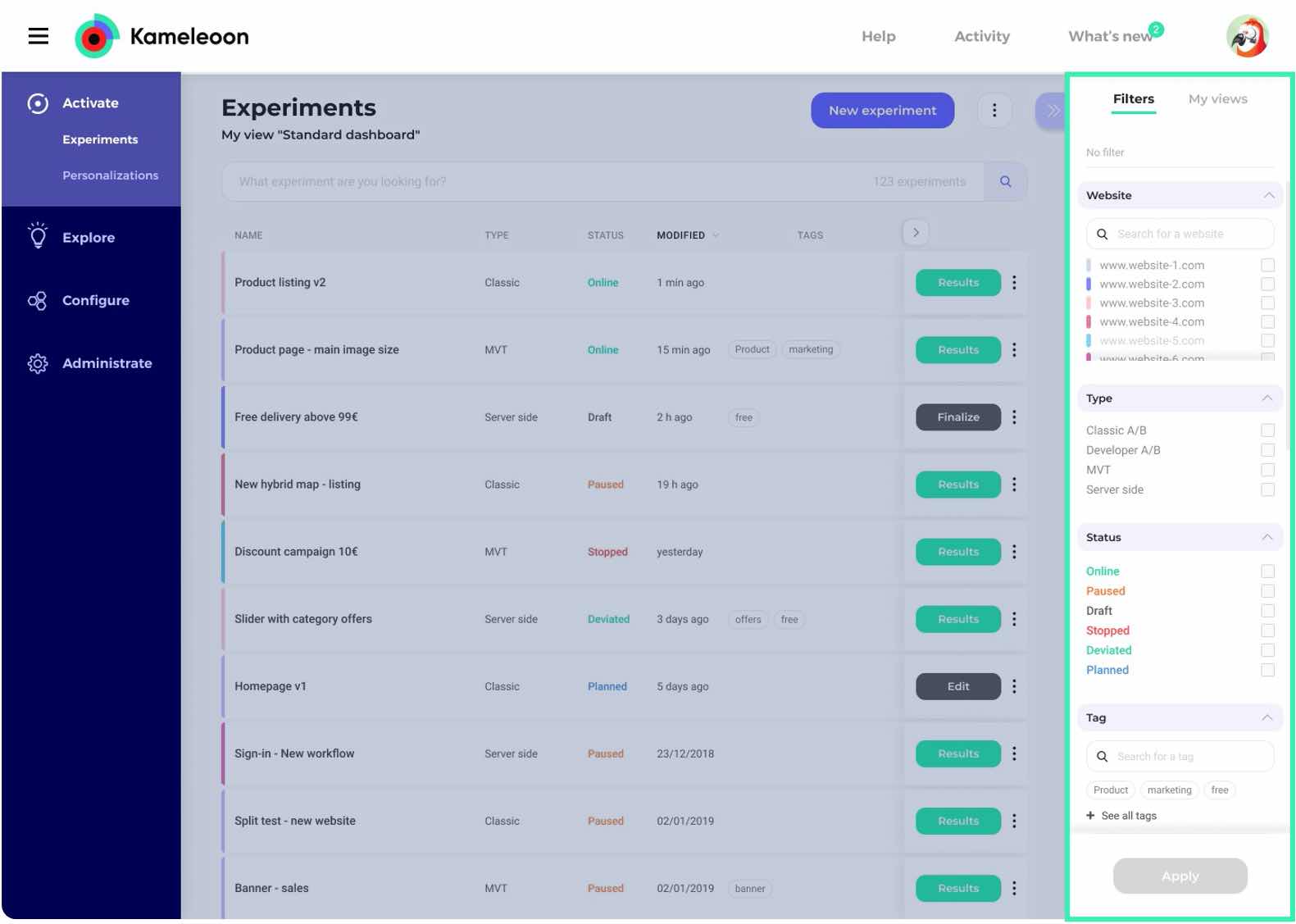
New filters enable users to manage their work as well as see what’s happening across the entire organization
From any page, use filters to find the object of your search in an instant.
Set specific privileges to users based on their role and by site. Go to Admin and set user rights by site(s) and by team role - on one easy page.
Foster a center of excellence. Filter campaigns by creator. Focus on your work or your teammates, and learn what is happening across your organization.
Multiple domains? No problem. You can now filter campaigns by domain.
View your work by type and segment. Easily organize all your A/B, MVT, and server-side tests and personalizations by client or server side. Only work in code? No problem. Filter that too.
Looking for a campaign related to visitor behavior or a custom data segment? Easily filter by any segment type.
Find what you’re looking for based on when it was created or last edited. Filter experiments, personalizations or feature flags by last modified, last status change, launch date, or creation date.
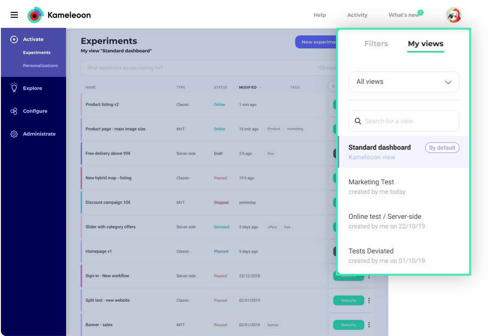
Personalize your dashboard based on your role and the work you do
Set your default dashboard based on your role. You see campaigns differently whether you’re a project manager, front-end developer, product owner, engineer or marketer. Now, each member of your digital experimentation team can customize their dashboard based on their exact needs. Once set, it’s loaded every time you visit the solution.
Easier ways to take next steps with your existing campaigns
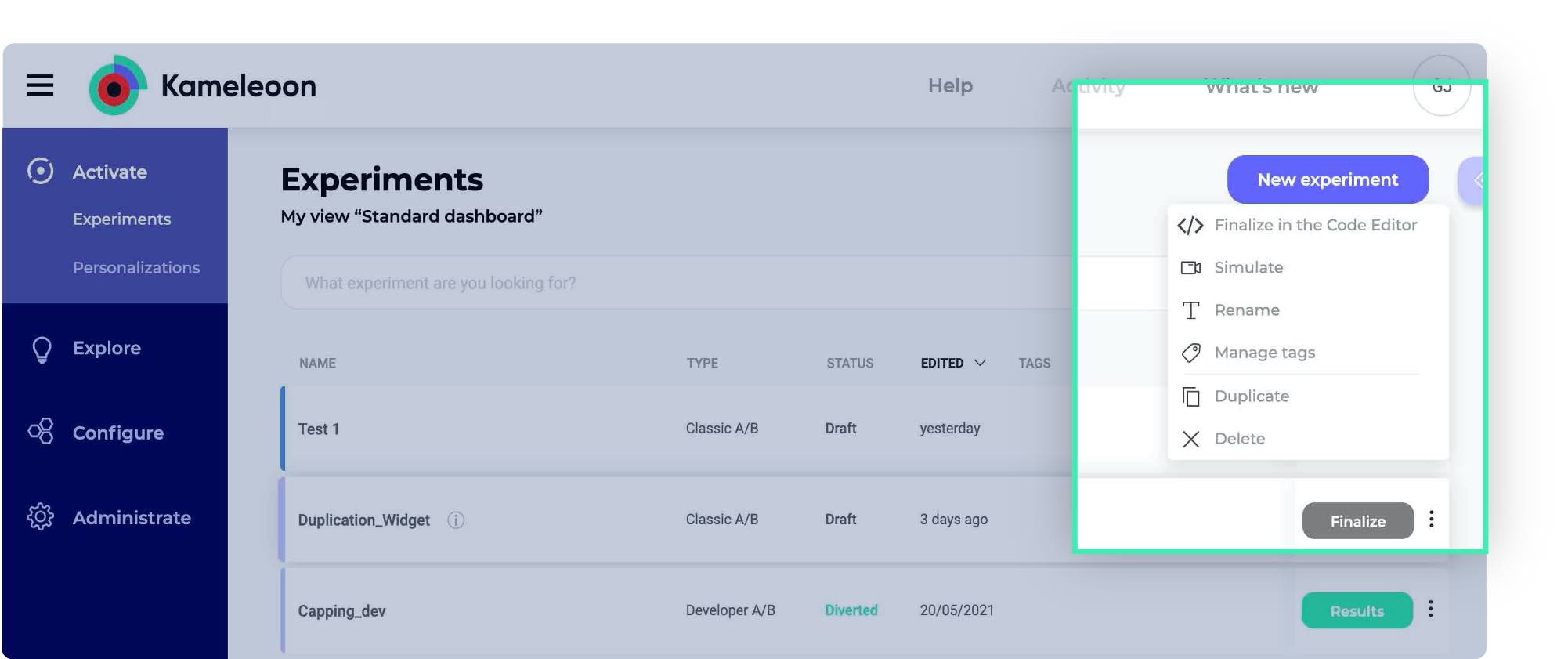
Larger CTAs. See results for campaigns that have ended, edit campaigns already launched, or finish finalizing campaigns so they can go live in one click.
A new action menu allows you to modify every A/B test, personalization and feature flag. Click, and based on the campaign type, you’ll be able to Simulate, Rename, Manage tags, Duplicate, Delete, and Finalize your work in the Kameleoon code editor.
Select multiple items.
On the Goals and Segment pages, you can select multiple items and edit them all at once. Add new tags, revise targeting by segment, add or delete a KPI.
2 A brand new, modern UX
The HORIZON design for Kameleoon aims to make your daily work easier and more enjoyable.
Crisp designs and graphics meet thoughtful touches. From where you integrate your martech solutions to the graphic editor or the simulation tool, you’ll find a clean new design and modernized graphics for all our solutions. Little things that aim to please.
- Larger window pop-ins take advantage of the new design
- Column titles remain visible when scrolling
- A “Return to the top” link easily sends you back for full platform menu actions
Work on any device. Whether you’re working on desktop, mobile or tablet, the new responsive design makes it easier for you to create and manage your optimization and personalization campaigns at any time.
With up to 600px resolution, the HORIZON design makes creating campaigns with the smart graphic editor on your mobile or tablet easier and more comfortable.
3 Support and assistance adapted to all situations
Finally, we have upgraded our onboarding experience to help everyone quickly get testing quickly and easily, no matter their level of experience in optimization.
Improved access to our help section and guides
A guided tour and tool tips will show you how to use Kameleoon like a pro. Now, if you’re new to Kameleoon, or if you want a refresher, you’ll find a guided tour and tips to help you quickly get the most out of the platform.
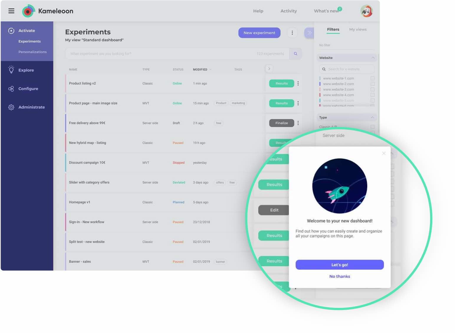
Have a question or running into a problem? All our help resources are now easily accessible in the header. Find links to our redesigned:
User manual. Learn how to use Kameleoon and begin building skills in A/B testing.
Developer documentation. In addition to matching our new visual identity, the you’ll find all technical information about our APIs, SDKs, and much more.

