31 conversion rate optimization tips for brands using Shopify

You've built a beautiful and powerful website on Shopify Plus and you're paying what seems to be a fortune to drive traffic there, but so far, you're not seeing the sales you KNOW you can make. Enter conversion rate optimization (CRO), a catchall term to describe digital experimentation and customer experience optimization.
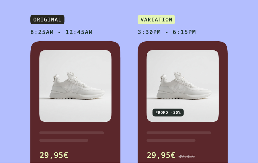
CRO relies on exploring customer data to generate data-driven ideas to optimize an experience, for example, how customers discover a product or checkout. New solutions are carefully A/B tested to validate that they perform better than the current version. The HIPPO, or the highest-paid person's opinion, is neutralized in favor of the customer.
It's such a successful practice that brands that are insight-driven - using A/B testing to optimize digital experiences - grow at least eight times faster than global GDP, according to Forrester research.
While every brand on Shopify is unique, there are some common practices that can help boost your brand's conversion rate. To help, here are key insights:
1. Start with the home page
The homepage is a great place to start with conversion optimization, because it’s where most of your traffic will come from. Once that’s optimized, you can use some of the same strategies to optimize other pages on your site.
When optimizing the homepage, remember that the goal of the homepage is not to convert – it is to help the visitor take the next step in the conversion funnel, such as navigating to the product category that best matches their need.
2. Use a low intent CTA
Realize that when consumers land on your site, they’re not necessarily ready to buy. The job of the homepage is to get them to take the next step, and move down the sales funnel. Too many brands have calls to action (CTAs) like buy now or add to cart. Instead, consider a low intent to purchase CTA (that’s for people who want more information but aren't quite ready to buy) like inviting them to explore the product line.
Additionally, when listing products on the homepage, have a clear low-intent CTA under each that's related to the product. In other words, instead of "Buy Now", try something like "Learn More" or "View Details".
3. Remember, you’re not Facebook
People don’t come to your site to hang out - it’s not Facebook — they come because they have a pain or need and they want to know if your site or products can help them. If it can, you need to make it as easy as possible for them to buy the solution.
4. Show your value proposition early
Have your value proposition early on the page - the headline is one of the best places - to let consumers know what problem you’re going to solve or what you’re offering. Simply focusing on the product, as many do, doesn’t tell the customer what makes you different or better than other solutions, and what pain you’re going to solve. So be sure to focus on the benefits in homepage copy.
5. Highlight free shipping and returns
After testing multiple messages, the one notification bar message that converts best is free shipping. Consumers have been trained to expect this by Amazon and others, and when you put it there, you’re eliminating a concern upfront, and consumers feel better about moving forward. You can also do that with free returns.
6. Lose the hamburger menu
You see a lot of hamburger menus on sites, but these are wasted. Hidden navigation won’t help your customers understand what you’re selling, and that’s a big issue when it comes to conversions.
7. Align your navigation menu correctly
I’m 100% in favor of horizontal navigation versus vertical navigation. Eye-tracking studies show that consumers read in an F pattern. So they start on one side, read over the navigation, then down a bit to the main messaging area with the value proposition. Horizontal navigation makes it easy for them to do that.
8. Reduce navigation menu items
Few sites should have more than five or six navigation items, plus a contact link. For best results, navigation menus should clearly show the main product categories that help people see what you’re selling.
Avoid using “Home” as one of your navigation labels, as consumers are already trained to click on your logo for this. And avoid talking about your brand in the main navigation, eliminating items such as “About Us.”
9. Don't split the navigation menu
Related to that, don't split your navigation menu. Put your logo on the top left corner of your site, not in the middle of your navigation.
10. Avoid “shop” and “new arrivals”
Avoid the word “Shop” in your navigation, as it doesn’t leave any scent trails for for potential customers to follow. Also, you typically don't need "New Arrivals" in your navigation because customers will just go to the category they need, and find the new items from there.
11. Don’t cater to bargain shoppers
Remove “Sale” from your navigation menu. While you're always going to have bargain shoppers, you want them to see the full breadth of your products instead of just going to the sale items. Similarly, avoid putting discounts, specials and offers in the navigation bar.
12. Optimize for the desktop
Know that most conversions come from the desktop, so there’s a higher impact from making changes to that version of your site. That said, your site should be responsive or adaptive for mobile so any CRO gains made on the desktop version should also apply there.
13. Avoid auto-rotating slideshows
I do not believe you should be doing auto-rotating carousels. We’ve done a lot of research on auto-rotating slideshows. The University of Notre Dame also did a study and found that 1% of visitors click on the first image, and then from there under 1% of that 1% click on the following images. At The Good, we've seen similar results.
It's not uncommon that the consumer is trying to read and understand what's in that first carousel, and then it automatically moves on. That becomes so frustrating that they give up and scroll down.
14. Randomize images for click-through carousels
If you’re going to use a carousel, don’t set it to auto-rotate. Instead, choose one of the images to show at random. That way, your marketing team is still getting multiple messages out, but doing it in a much more effective manner.
15. Make your home page headlines count
Every headline and CTA at the top of your homepage should address the customer's pain point or fear of missing out. It’s a way to show the real value proposition.
16. Put social proof in the right place
On the homepage, build trust with social proof such as recognizable logos and customer testimonials. Social proof in the form of product reviews should be on the appropriate product page. Company-wide reviews can be on the homepage, but just call out the one sentence that is going to be most impactful, because consumers will not read a wall of text.
17. Broaden the products shown on the homepage
Focusing on one or two products influences everybody into checking out just those products and they're going to miss everything else. That's why I don't recommend it.
18. Use real people to show products
When looking at items of clothing, the person modeling them makes a big difference to conversions. We’ve tested real-life people wearing products versus the most beautiful models you can find and the real-life models always convert better.

19. Lose the payment icons
There is no longer a need to put payment icons on the homepage. In fact, it can hurt your credibility, because larger brands don’t do this. Every website now takes at least one form of payment. The place to put payment icons is at the checkout, so customers know what the options are, where they need to know that information.
20. Use recognizable icons
If you are using icons and text to show features or benefits, make sure the icons are universally understood. Avoid putting too much text below the icons. Keep text below icons to one line at the most, because consumers are going to be skimming this text quickly.
21. Homepage blog content can hurt conversions
When you put blog content on homepages, you are sending people back up the conversion funnel. Blogs are great for getting people to your site, but if somebody reaches your home page that's actually deeper down the funnel than a blog post. You'll see a big abandonment rate from people who go to shop from those pages.
22. Don’t reverse the funnel with social media
The biggest mistake I see with social media widgets on homepages is that they link out, which is sending consumers back up the funnel to the social media site (like Instagram), where it’s really hard to convert somebody.
It can be helpful to have user-generated content on your site but you need to make sure that when people click those images they deep link to your site. There are some great tools to help you do that in the Shopify App Store.
23. Optimize your footer for conversions
Every footer needs three different elements. From left to right, there's product navigation, useful links, and contact information.
Product navigation gives someone who's scrolled to the end of your homepage (and therefore is likely to be interested in your business) an easy way to take the next step in the funnel.
The middle has information that can help customers such as returns, customer service information, and so on.
On the far right, you should always have contact information, ideally a physical address, an email address, and a phone number. If you have all three of those, the trust level dramatically skyrockets. It shows visitors that you’re real and you’re not going to steal their money. This information is on the right, because that is where consumers are trained to go if they want to get in contact with a brand.
24. Lose the spin to win popup
I’m not a big fan of spin to win for a couple of reasons. First, you’re covering up your entire site which is off-putting. Second, if this pops up right away visitors don’t even know what you’re selling or if they’re interested.
Someone who just got to your site isn’t ready to make a purchase or give you their email address. Popups should only appear to the target audience for successful personalization.
25. Don’t offer discounts in your popup
Discounting is a deep hole to dig yourself out of, because the problem is you’re telling people your products aren’t worth what you charge for them. If you bring someone in on a discount, they are forever a discount customer and they’ll never want to pay retail again. Plus, you want people on your list to actually want to be on your list, not just get a discount code and then run away.
26. Put your email signup form in the right place
For your Shopify homepage, bake your email signup form into your footer. It needs to have three things. First, set expectations about what the customer is signing up for and how often you'll email them. Second, a brief privacy statement showing that you'll never sell their email address. Third, let them know they can unsubscribe anytime.
27. Keep email signup forms short
The shorter your email signup form, the better the conversions. When you ask for both a phone number and email address on a form, conversions are going to drop, and the more fields you have, the more information you're asking for, the lower the conversions are going to be.
28. Do customer research
The best way to understand what needs to be on your site or navigation is to interview your customers. And you don't need to interview 100 of them; you only need to talk to five. After that, you typically start hearing the same information over and over again.
29. Talk about yourself in the footer
For business-to-consumer (B2C) sites, anything that has the word "us", like "Contact Us", "About Us", and so on, should be down in your footer. It may be different in a business-to-business (B2B) context, where they need to get more background on who they might be working with, but for 99% of Shopify sites, this is a good rule to follow.
30. Focus on new customers
If you orient your site towards new customers, you will also be serving people who are coming back. Remember, new customers want to understand if you can solve their pain point, and then to get that solution. Returning customers just want the solution. If you offer them an easy user experience (UX) then you'll be in a good position for both user types.
31. Always be optimizing and testing
To boost conversions, you need to be improving your site every day. So make a small tweak on your landing page for example every day based on consumer interactions and feedback, and your site will be 100 times better.
With so much of your traffic landing on your homepage, it's important to continually optimize your site to give visitors what they need and convert them to customers. Following the CRO tips above will help you improve your site to build engagement and boost sales.
-
Thank you, Jon! If you haven't already, view Jon's live teardown on Shopify.
Did you know? Kameleoon is fully integrated with Shopify.
Connect the two platforms easily and quickly and begin to use customer data from your store on Shopify to create a/b tests and personalizations. See what it can do! Kameleoon & Shopify Integration


