3 ingredients for a high-converting product page

A product page should be optimized to the bone, and it's often not the case. In this article, we'll teach you how a well thought-out UX can boost your conversions and which elements to bring forward. Like the saying goes, you don't have two shots at a first impression! Your product pages are crucial to your website.
Why? Picture this. You read through the description of a product and you feel underwhelmed. It's vague and too short. What do you do? You turn back to Google, look for another site. Bad product pages have a huge impact on your visitors perceive your brand. For example:
- The visitor can't determine if the product corresponds to what he's looking for and answers his needs;
- The visitor is impressed by the product; buys it... only to discover that it isn't what he really was looking for.
In both cases, you'll have a annoyed customer who most likely won't come back. And who'll maybe generate additional expenses if he returns the product.
In this article, we'll convince you that you absolutely need to optimize your product pages. They must contain information useful to the visitor. But not only. Many e-commerce websites don't go further than this. We think a product page should do much more: it needs to sell the product and guarantee that it answers the visitor's needs. We'll see how optimizing your product pages can answer to 2 complementary goals:build trust and elicit a desire to buy. In other words, you'll learn how to reduce the fear and doubts your visitors might have. To help you do that, we'll give A/B Tests ideas along the article.
1/ Strong visuals
A picture is worth a thousand words. This is particularly true in sales—and often neglected, sometimes because optimizing every picture would be a stupendous task if you have thousands of products. But it IS a worthy investment, with a high ROI. In this study used by Forbes in this article:
- Products with striking visuals have 94 % more views than those without any;
- More than half of online consumers admit that an image search influenced their decision to get in contact or not with a company.
- 67% of online consumers state that the picture is a determining factor when they choose a product.
- More than 50% of online consumers think good quality picture is more important than the information on the page (from the description to the comments).
What's more, a product image can be a non-negligeable source of traffic.

According to JDNet, in France, Google Images generates every month 22 million visitors. A 30% increase in one year (source), a solid indication that online consumers often look at pictures when they're searching for a product.
« For SEO on Google Images, it's a lot of trial and errors, of course, we've been convinced for a long time of this channel potential. We're working with an SEO consultant on several criteria like tags, loading speed, image format,... ».Christine Burls, Business Development Manager de la marque Aquarelle.com
So, what makes a good product picture?

3 key factors for high-converting pictures:
Quality: bad framing or lighting can slice your sales down. The solution—although often expensive, is to hire a professional photographer. It can make all the difference in the world Size and resolution: your visitors needs to be able to zoom in, look at the texture and see every detail of your product. Quantity: your visitor needs to see your product in every angle and in several contexts .
And videos? Used more often in B2B, they help visitors understand your product better, improve your SEO (if they are hosted on Youtube for example). If it's the case make sure your title, description and tags are optimized.
To A/B Test: size, quality, number and location of your pictures.
2/ Strong copy
Your potential customer will just have a few sentences to understand the product: so you need to make it count! Your product page needs to be considered as a real piece of content, AND be an integral part of your content marketing strategy. The secret of good copy is to perfectly know your audience, so you need to double down on understanding your visitors and their needs.
In a conversion optimization strategy, the visitor is always front and center. You won't address a business man looking for inspiration and an operator looking for technical information the same way. Product descriptions are clearly a big deal and not to be ignored. Price isn't the only differentiating element, your copy or storytelling influences how a customer perceives your brand and helps build trust.

Find and answer customers' needs
You CAN differentiate by the price but if yours isn't a discount strategy, your storytelling will have an even bigger impact.
Bonus: 5 tips you can test to super-charge your product pages
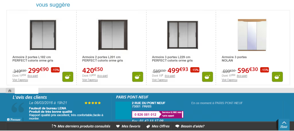
Bundling: the purpose of bundling is to increase the amount of the average cart, by offering your visitors the product he wanted to buy as part of a package with several other products. Up-selling: also aims to increase the average cart amount by offering to the visitor about to buy something, a more expensive product with usually more benefits, higher quality. Cross-selling: offer your customer products related to the one he's currently buying. Stock information: aside from the fact that it's reassuring to see the product is indeed available, it can create a sense of urgency in your potential buyer.
Product descriptions are essential, they basically replace what a salesman would say in a physical store. The efforts you'll put in this description will show how much (or little) you believe in your product.

Okay, so what do we put in this description?

Our guidelines for a strong product description:
Give enough information: according to a Nielsen Norman Group, 20% of conversion funnel exits after a product page were cause by a lack of information; Use the inverted pyramid technique: start with the big ideads then get down to the details; Be clear and concise: follow David Ogilvy's Rule #3: "Use short words, short sentences and short paragraphs.” Build a story aroung your product: an anecdote related to a material, how the product was made, where it was made, basically anything that could create an emotional reaction. Be imaginative: you can try to put original instructions Encourage action: don't forget to also optimize your CTAs, the best description in the world without a clear and accessible CTA is useless.
3/ Social Proof
According to an Emarketer study, almost 70% of online consumers read product recommendations before completing a purchase.
There are several advantages: people like reading them, it reassures them; search engine bots loves them. Your website is continuously updated with people's recommendations. It's user-generated content, free and advantageous. Bonus SEO: Product recommendations add data to your page, and can sometimes appear in search engine results pages, giving context and sometimes influencing visitors to click.
« Customer's product recommendations needs to be "Rich Snippets in order to improve your SEO. Other advantages, the product evaluation and the number of recommendations appear in Google's results and increase the click-through rate »Bruno Hétier, Allopneus.com
Should you use a notation system with stars? Or comments? Or both? Where, above or under the product? Once again it depends on your strategy. But it definitely can be a differentiating element.


Are you worried about negative critics? There are websites where only those invited can leave reviews.
A tester : l'emplacement, le nombre et la nature des commentaires (simplement des étoiles ? une note sur 5 ? une évaluation complète ?)
Your product page is one of the pivotal elements of your sales strategy. If there aren't enough information or the pictures are bad, you risk losing your customer. Always put your customer first and keep him in mind while creating product pages. You'll see a clear difference in conversion rate. We gave you the ingredients to craft a high-converting product page, but like always, you shouldn't blindly apply what you read. A/B Test everything to see if it's good for you.
REMINDER: Try to A/B Test:
Visuals: size, layout, number; Additional information: Reassurance, information on delivery, stock, refund, origin? Up-sell? Cross-sell? Bundle? Title and description: length layout, copy CTAs: layout, copy, design Social Proof: evaluations, recommendations, share buttons,…


