Lean into understanding the struggles of shoppers: Rishi Rawat, Frictionless Commerce

This interview is part of Kameleoon's Expert FAQs series, where we interview leading experts in data-driven CX optimization and experimentation. Rishi Rawat is a founder of Frictionless Commerce, an eCommerce optimization agency.
For people who haven't heard your philosophy before, can you explain why you believe the product page is more important than any other in an online store?

There are two reasons I say this.
1. In user recordings, we find that when users first land on a site they start clicking around like crazy. Once they reach the product page (PDP) they come to a grinding halt because they know what’s beyond the product page— pulling out their credit card.
This means that on their way to the PDP they aren’t paying full attention (since they are clicking and moving around so fast) so all the good stuff you may have on pages leading to the PDP are ignored or missed.
As a result, the marketer needs to ensure the PDP contains all the information the shopper needs to make the purchase.
If part of the pitch was made on the category page then it would need to be repeated on the PDP because it’s likely the shopper didn’t fully absorb it on the category page (since they were moving around so fast.)
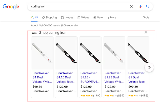
2. If you advertise on Google chances are you are using Google Shopping ads, which look something like this:

When people click any of the ads shown in the red box above they are taken directly to your product page. For this visitor your product page isn’t one of the pages on your site, it’s the whole site.
When you founded your agency in 2009, one of the biggest stories in eCommerce was the growth in consumers using this little thing called an “iPhone”. What’s changed the most in our thinking about eCommerce since then? What’s stayed true?
Great question. In 2009, the biggest online stores were reseller stores. Sites like Amazon and Zappos. These sites focused on giving shoppers a one-stop-shop experience.
Today, it’s all about the niche. There is a site that literally specializes in selling NHL Hockey ceiling fans:

So … yeah.
What’s also changed is how sophisticated consumers have become. In 2009 if you had an eCommerce site chances were high people who found you would buy. Today, shoppers have four (4) concurrent open tabs. If they don’t find what they are looking for really fast, they’re out of here.
Wolfgang Digital analyzed 130 million website sessions, over €330 million in online revenue, and calculated the average session duration (time on site) for all of eCommerce at 2 minutes and 32 seconds.
To put this is in perspective, their 2019 report had the average session duration at 3 minutes 1 second.
This means the average time on site is going down year-over-year.
What hasn’t changed is human psychology. And this is why understanding the psychology of your shoppers is, and will always remain, the marketer’s ultimate superpower.
What common elements do you think every Shopify shop owner needs to pay attention to in designing their product pages, regardless of what they’re selling?
A few things:
A: Be aware of the fact that your visitor is paying half their attention to you and has four (4) other tabs open. So job #1 is to activate their attention and get them to stop thinking about comparing products.
B: Shoppers are exposed to hundreds of ads a day. So our brains have developed shortcuts to navigate this neon maze.
So far, we’ve identified nine things that the shopper is subconsciously seeking that the marketer needs to address:
- People are skeptical of “too good to be true”
- They find expertise sexy
- They root for people who beat the odds
- They are fascinated by surprising details
- They are visual animals
- They need motivation to break habits
- They love personalized experiences
- They like knowing they’ve stumbled onto something rare
- We must resolve their negative thoughts
To see how to deliver on each of these items (with examples) head over to our conversion copywriting article.
You’ve talked in the past about finding creative solutions for working within a customer’s design constraints. Sometimes you say they’re a CEO’s constraints or from someone not in marketing. What’s a creative solution for working within these constraints?
This has been a tough nut. The moment we change the design of the PDP it now becomes something a committee needs to vote on. That really slows down testing. To bypass this we don’t change the design; instead we create paths for diggers (name for shoppers looking for detailed information) to get to that content, which is presented as a lightbox.
The beauty of this approach is that now the client doesn’t have to worry about the page design getting "messed up". To see how we’re able to improve conversions without redesigning the page see this PillowCube case study.
Complete this sentence. The best and fastest way to build your career using experimentation for an e-commerce brand is…
… lean into understanding the struggles of shoppers.
In experimentation, quantifiable results are obviously important. But you’ve often talked about making eCommerce marketing strategies focus more on individual buyer psychologies. How can marketers better reveal those hidden psychologies through testing?
I’m not focused on individual buyer psychology, I’m focused on specific types of buyers, namely, first-time buyers. This group is narrow but it’s still large enough for A/B testing.
What can in-person retailers do today that you wish we could do with an online product page? Do you think the tech will ever exist to support that online, or will that always be an advantage of selling in-person?
In-person selling will always be more effective. But it isn’t scalable. The advantage of the PDP is that it’s selling outside of store hours, it’s working on the weekends.
The good news is that technology is bridging that gap. For example, we’re experimenting with a concept called Active Participation.
Using this approach you don’t have to show everyone the same PDP, the page can change based on the personality and preferences of the visitor. It’s already generated massive conversion lifts. See this.
What was one notable A/B test you ran whose results surprised you or your client?
To find out if your store can increase conversion rates and provide a better customer experience with an advanced experimentation tool like Kameleoon, book a demo call.
Kameleoon is an advanced client and full-stack A/B testing and personalization tool with Shopify Plus integration to make customer experience optimization easy for eCommerce stores. Its unlimited, flicker-free A/B/n testing, AI personalization and real-time data reporting help mid-size and enterprise brands create world-class online shopping experiences.


