Shopify teardown reveals how the top stores build relationships and optimize for new and returning customers
In 2020, just 2.17% of e-commerce store visits converted into purchases.
Which means a whopping 98% didn't convert!
That’s a powerful number that optimizers hold dearly, as it speaks to the importance and value of A/B testing and conversion rate optimization (CRO). But there’s a more powerful number, the 80/20 rule.
You may have heard it before.
80% of your sales will come from 20% of your website visitors.
80% of your sales will come from 20% of your products.
80% of your ROI will come from 20% of your marketing campaigns.
Trying to convert 98% of your website visitors to buy a product upon arrival is not, ahem, a realistic goal for any online store.
The best stores on Shopify know this. All great e-commerce stores, wherever they are hosted, focus on building a long-term relationship with their customers. They know that nearly 65% of their total sales will be from returning customers.
The best e-commerce stores optimize their sites so that:
- New customers are clear about the customer need they are satisfying
- Returning customers are served consistent and relevant content, services and products
- All customers can quickly and easily find and pay for what they are looking for
We invited Jon MacDonald, CEO and founder of The Good, an optimization agency, and Val Geisler, Chief Customer Evangelist at Klaviyo, to join us at Live Session by Kameleoon. These two customer-championing experts shared how valuable it is to build a long-term relationship with the human that is shopping your site vs. thinking exclusively about them as an immediate chance to convert.
Through live analysis of real e-commerce stores, we picked up some powerful takeaways.

It’s expensive to keep acquiring new customers, especially when existing ones are so valuable.
Yes, you want to convert, but more importantly, you want to build relationships. By building a relationship, you have a MUCH higher chance of conversion and repeat business.
1 Don’t neglect new subscribers as a conversion goal
It's not Add to Cart vs. Subscribe; you need both.
Getting the email (or cell number) is the new "break-even." Jon shares that brands are increasingly seeing the value in getting people on their email or SMS list and that (email or SMS) subscription is a valuable conversion.
"I hear from a lot of brands lately that they'll even break even on that initial sale just to be able to have that customer information."
Jon points out that "converting into an owned list is almost as important as that final sale."
Earning a subscriber IS a conversion goal. By all means, get that sale, but make converting a visitor into a subscriber also a goal.
"I don't think that converting to purchase is a reasonable expectation from every customer," notes Val. "In my experience, the best path is to convert to a subscriber."
That's a conversion in a sense—the somewhat easier one.
"If converting to paying customers is the most challenging conversion, then the low-hanging fruit of that is converting to subscribers and building a relationship… and then converting the subscribers to customers."
2 Optimize your newsletter offer, not just your checkout.
Optimize your newsletter offer, not just your checkout.

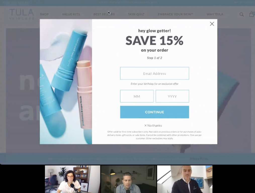
A discount is not the best bait. An email obtained in exchange for a coupon code might only get a one-off sale. Instead, focus on selling the value of becoming a subscriber and actually deliver it. That's how you build a loyal subscriber base that, in turn, leads to repeat purchases. By converting a customer into a returning customer, you can nearly triple their lifetime value.
Place your opt-in boxes prominently on your store. Don't dump your signup offers inside your store's footer or right above the footer that few people will get to. Ensure good visibility for these offers just the way you would for your sales offers or promotions. Also, placing the opt-in offer only on the checkout page "leaves a lot of money on the table," cautions Val. "It's saying that the only people you want to talk to are people who pay you money!"
Optimize your opt-in offer copy and CTA just as you would optimize a real offer. Because, as we're seeing, it IS a real offer. Explain the benefits of subscribing, sell what's in it for them, and feature social proof.
SMS vs. Email: What do you ask for? Both channels have their place. But email is naturally the more mainstream option. Some brands ask for both, and Jon notes how the conversion is naturally lower in this case. If you're building both email and SMS lists, offer different value from both. Val encourages brands to think about what they can offer an SMS audience that they can't offer anyone else—a voice in developing in the next range, for instance.
Keep your discounts consistent and logical. Avoid giving a 10% discount upon arrival and then a 15% discount when leaving.
Don’t stop once you’ve collected an email address. Tools like Klaviyo help you to easily automate welcome, win-back, and abandoned cart emails.
3 Think about your customer experience and optimize accordingly.
Your online store's buyers are as real as the real people who walk into stores. Don't forget this. "Just because you can't see them on the other side of the screen," emphasizes Jon. "Make sure you're treating them as you would treat any other retail customer."
You wouldn't badger someone who walked into your real store for a sale; don't do it to your online store visitors.
Don't go "shop shop shop!"
This applies to opt-in offers as well. Val says don't be the brand that goes, "I want your email. I want your email. I want your email."
Make it about them.
"It's not incredibly compelling to be the first to hear about new products, special deals, and exclusive partnerships," says Val. "That actually sounds like it's really about the brand." "It's not for me. It's not a gift. It's not something that is adding value to my life."
Reset to become an experience-led business and aim to make the shopping experience frictionless.
Personalize messaging with segmentation. To put this in perspective, think about an e-tailer into beauty products. You're looking at multiple segments here: skin care, hair care, cosmetics, hygiene, and perfumes, just to name a few. Then you have geographic, demographic, and behavioral segmentation as well.
Slicing and dicing your customer base to map to these is the key to offering personalized shopping experiences. Such experiences that feel one-to-one go on to generate more revenue and build better customer relationships for you.
Everything from the offerings to the UX and messaging can be made more relevant with segment-level personalizations.
Quizzes can be a great way to help your customers discover how you can help. Think of them like their personal shoppers, says Val. Quizzes make shopping easier for your visitors and help them choose better products. So add quizzes to your online store CRO mix and place them prominently on your homepage. The data your quizzes collect also helps with building segmented email and SMS lists.
If you’re looking for an app on Shopify to help you with quizzes, try Octane AI, says Jon.
4 Run experiments to optimize UX
There are no best practices. There is what you prove works best for your customers i.e. your business through A/B testing. Jon and Val share a few e-commerce UX pitfalls that you should test to see how they may affect your customers.
Drop the carousels. More often than not, instead of helping you promote more offers and use your store's primary real estate (the hero area) better, carousels end up distracting your visitors. In place of a carousel, place your UVP here. If you must use carousels, optimize them. At least, don't use the auto-forward ones.
Design better navigation menus (sticking to the F-pattern can work). In line with how people read (from left to right), putting navigation items to the right can be more effective.
Also, adding menu items like "sale" and "offers" prominently in the navigation menu isn't always a good idea. It can cheapen your brand.
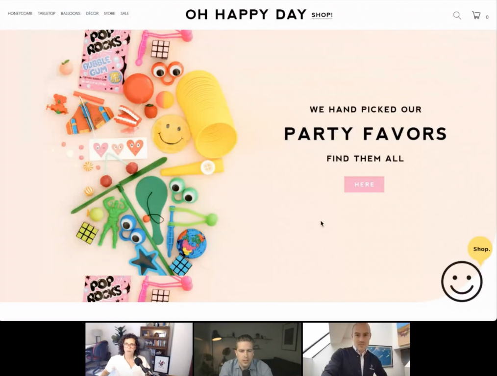
Rethink your store's homepage; it's not (always) where you convert. Keep low-intent CTAs (like "Learn more") on the homepage and avoid the more commercial ones like "Shop" and "Add to cart."
"You know the whole goal of your homepage, if you think about your site as a funnel, is just to get people to that next step in their shopping journey."— Jon
5 Tap into cognitive hacks to make shopping easier
Nudge your visitors' subconscious buying impulses.
Offer free shipping or make shipping fees feel small. Jon has repeatedly found the free shipping promotions to work well across the board for online stores.
But if you must charge shipping fees, position it in a way that it feels insignificant — for example, pitch a $3 shipping option against a $93 one and make choosing the first one painless.
Feature your best sellers. Tagging your best-selling products on a product page is like offering social proof to get your users to add them as well to their carts in addition to the product they're checking out.
When recommending your best-selling products, though, avoid calling them "recommendations." Because you don't know your visitors well enough to make good recommendations, yet. Instead, just use the term "best sellers."
Don't make your visitors think. Don't end up offering too many offers on your store. Doing so puts your visitors in a perpetual state of analysis, and they get engaged in deciding which is a better offer rather than buying what they came for.
If you offer discounts, keep them consistent across your store.
Want more?
- Check out these 31 conversion rate optimization tips for brands using Shopify.
- Reach out to Val Geisler or follow her on Twitter.
- Email Jon.
- Watch the replay (for those who registered).
- Get a special rate for a conversion audit from The Good. Code: Kameleoon
- Have a closer look at how Klaviyo can help you build a loyal subscriber base.
Thanks to Jon and Val for all their great advice and tips on what the best stores on Shopify do. Didn't register but want to see a replay? Write to us at hello@kameleoon.com.
Kameleoon is fully integrated with Shopify Plus. Learn how we support e-commerce and retailers with all their A/B and full stack testing and personalization needs.


