How can I use color design in conversion optimization?
This interview is part of Kameleoon's Expert FAQs series, where we interview leaders in data-driven CX optimization and experimentation. Brian Cugelman, PhD, is a scientist, educator, and innovator in psychology-inspired technology. He’s spent over a decade teaching top companies (Salesforce, Samsung, LinkedIn, Google, Facebook, Microsoft, etc.) through his school, the Behavioral Design Academy, and he teaches at various universities.
What aspects of website optimization can I apply color design to?
Generally, I consider three main buckets where color design principles can be applied:
- Navigation systems: color can help people understand where they are in a process. Branding assets are another aspect where color helps a user know whose property they are on.
- Messaging systems: using color to indicate hierarchy or draw attention to important messages and microcopy. For example, your H1 might use the brightest font color, and your H2 might be a little darker, so messages pop out systematically.
- Types of nudges: e.g., using color to make psychological design strategies.
You should use colors consistently. In a process context, you might use red to show users they’ve made a mistake. When you shift to a motivational context, you might also use the color red for stress induction techniques like loss aversion. But if you use them inconsistently, they’ll be less effective.

Understanding that highly contrasting colors draw attention, we can strategically design color palettes to make everything a little bit dull and unappealing or ‘un-salient.’ Then when you have a money-making call to action that your business depends on, you pull out a color with the highest contrast to the surrounding design.
With this design strategy, your ability to create attention-grabbing calls to action has more to do with your dull backdrop than your exciting foreground. It’s like when the star of a film tries to get a lousy supporting actor, so they look better in contrast.
But you only get this by architecting your whole color palette. So don’t just focus on the color of buttons, but the color of everything around the button.
Can color psychology be universally applied?
There are a ton of blogs about color psychology that say things like “red means anger” and “green means envy,” and they make it sound like it’s a global truth. But it doesn't work that way because context is crucial. For example, red can signify; stop, danger, love, poor health, good health, and so on.
There’s a new theory called color in context, which argues that color associations are context dependent. Change the context, and the color’s associations shift too.
This is why global claims about color and emotion tend to be ridiculous generalizations. Color associations are valid, but they’re specific. So, avoid the blogosphere and head to Google Scholar to look for reputable studies that other scientists cite.
I would be very wary of any study that didn't consider color and context because you can’t analyze one without the other.
In answer to the question, I think color psychology can be universally applied when the context is considered. Here’s why;
- I think that our globalized world means we're more likely to have universal color associations. Everyone uses the same online platforms, exposing them to the same color palettes and meanings.
- I think the context-specific, universal associations we have between emotion and color are innate and thus universal.
There have been good studies on emotion and color associations across countries, which found similar associations worldwide. I believe our facial colors offer one of the best explanations for this effect. It’s not just the physical movement, such as a smile, that tells us someone is happy.
Our facial colors shift due to oxygenated and deoxygenated blood flow. I know this may sound counterintuitive, but recent AI image processing studies have revealed that our facial colors shift systematically as our emotions and physical state change.
Every human raised in a culture with other humans understands these body colors. I believe this might be the basis for our universal color associations and why they have specific meanings depending on the context, e.g., red can represent intimacy or anger depending on context.
It’s worth remembering, however, that there are also local color associations that apply only to specific cultures or groups. Think of any subculture; almost every ‘tribe’ has its colors and stripes.
Suppose you are targeting people where the origin of a product is important. In that case, you might use the colors of the national flag, which those people will recognize, to elicit the desired emotional association.
How can I use color design to trigger decision-making?
To influence decisions, we need to focus our efforts on what we make salient and what we don’t want to make salient (but you need to ensure you don’t cross legal and ethical lines).
For example, you might use colors people dislike on the cheaper products to nudge customers towards costlier products. Interestingly, many of the colors people dislike and want to avoid mimic the colors of human bodily waste or rotting food.
But really, it is not sneaky nudges that are most important when influencing decisions; it’s the perceived level of trust and credibility. And color can help here too.
For example;
- An unknown brand/website can use similar colors to established brands to look more credible through association. I saw this technique in action when I was involved in the United Nations volunteer rebranding. The problem was that we were a UN agency, but people didn’t always realize it. The team studied all the colors of blue used within the UN branding system. They lined them up and suggested our UN agency should use the mathematical “middle blue” so the public would instantly recognize that we were a UN agency. It was so successful other UN agencies copied the color and branding strategy.
- A company that uses environmental messaging might use forest green to enhance users' trust in such claims. A medical site may use baby blue. Any brand may benefit by wearing the colors of its market to boost instant recognition and perceived credibility.
How can color principles backfire?
Colors can be used “wrongly,” and it’s usually when they go against conventions that cause us additional cognitive load to decipher their meaning. As mentioned above, our color associations may be rooted in reading other people's emotions through facial color shifts in different contexts.
Researchers are looking at congruency and incongruency—the idea that if a person is happy but we see a photo of them with a bluish glow, it strikes us as wrong. You're nailing human intuition when you can cause someone to feel something's right/wrong in a way they don't perceive.
This is important because our emotional reaction time is faster when congruent color emotions are present. In conversion design, if you need to use the same color for different meanings, change the saturation of the color to avoid incongruency.
If there isn't any preexisting color association, you can establish one as long as you’re consistent.
Fun fact: The color system we work with on computers today doesn't allow us to represent the full spectrum of human vision. While probably no system will be able to do that, RGB doesn't even let us represent a good sample of the range of colors.
Because of this, no one can research color using standard computers or monitors. To properly study color, you must go to a scientific grade color system based on CIE XYZ, using specially calibrated monitors to represent the full spectrum.
How can I use the Color Psychology Map to elicit different emotions from web users?
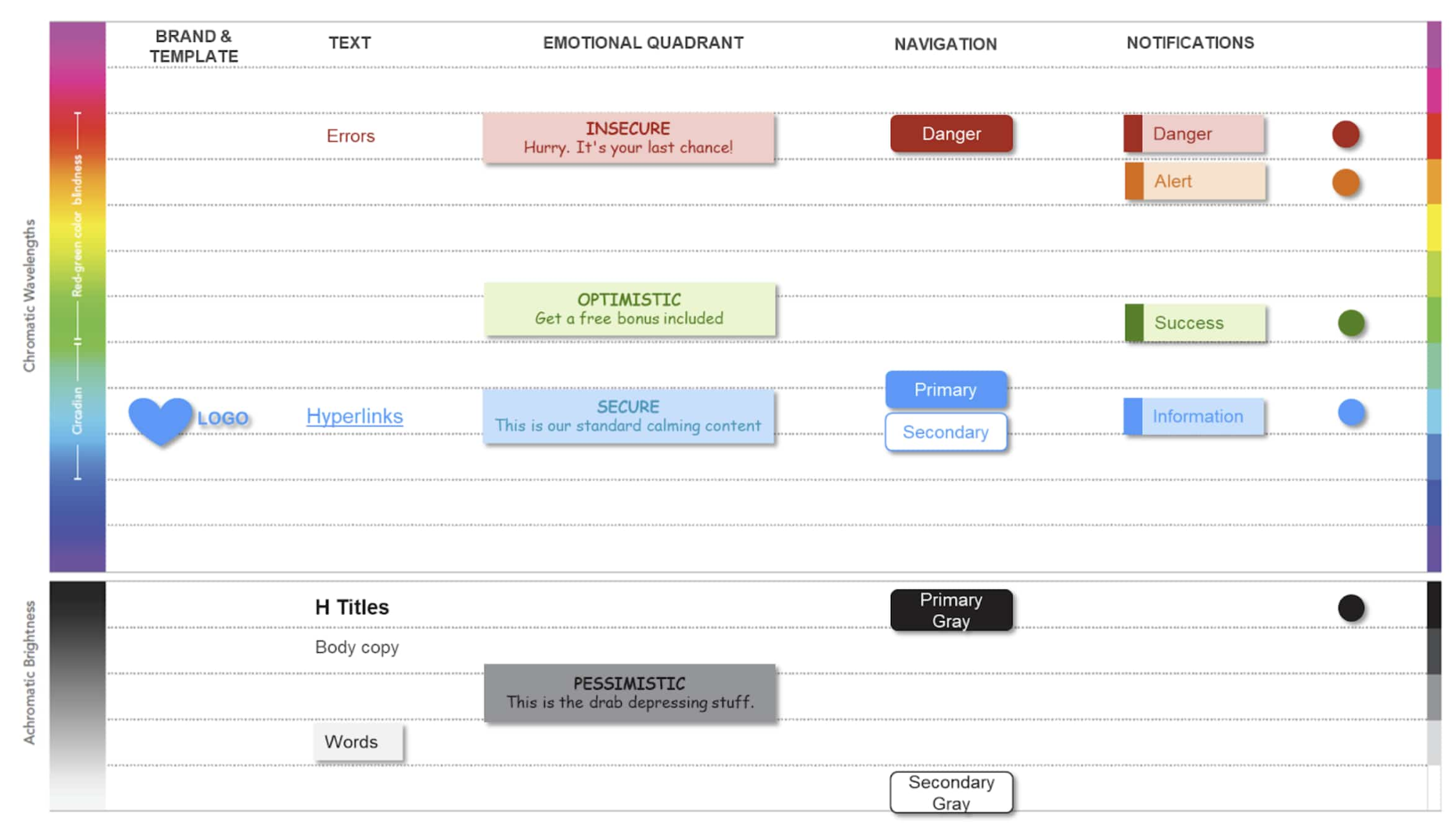
I developed a suite of behavioral design tools for my students, and two of them fit together in a way that’s extremely insightful. The first is a framework that I use in emotional design, with four quadrants representing broad categories of emotions. Within each quadrant, there are specific emotions that you can target.
From my experience, it’s hard to match colors to every specific emotion, which is why I use broad emotions rather than attempting to dive into the nitty-gritty of every color for every emotion.
Because who can train their colleagues to identify discreet emotions and consistently associate colors with them….Imagine if you’re the brand police of your organization. Do you really want to get into absurd arguments with your colleagues: “No! that’s not the schadenfreude color!” or “Didn’t you read the brand guidelines? The color of existential joyful angst is aqua-beige.”
Broad motivational colors, optimism, pessimism, threat avoidance, and reward maintenance are simple and cover most emotional design challenges. Though there’s no hard rule, I like to build on cultural color associations, and yes, I’m a sucker for traffic light colors because the entire planet has been taught what they mean. Here are some conventions I like to follow.
- Green colors are generally good for optimistic, positive emotional states or those associated with opportunities people are motivated to get. Therefore you might use green when you have offers and incentives. But it could also represent an opportunity related to status, hierarchy, or helping people develop new skills.
- Red colors are good for representing loss aversion and stress induction or pressure tactics. This is where you’re trying to crank up the heat to get someone to take action. Think of it like running from danger motivational design—the clock is ticking.
- Blues are generally used for a more calm “business as usual” emotion.
- Greys are more depressive, powerless types of emotions. I tend to avoid these, but they have their place in interactive design.
What’s your advice for individuals looking to influence those around them to take positive social action?
Many people who work in social change are trying to change the world but will never do it on their own. So the only way to impact the world is to get other people involved.
You have to nudge others around you, who then go on to nudge others around them, resulting in a snowball effect.
Just because you're a non-profit doesn't mean people will trust you, and sometimes, people are hostile. But we can help charities use brand colors that help win trust with their target audience.
We can help them identify motivations. One of the worst things you can do is to try to convince people to take action by saying they’re saving the world. Because unfortunately, most people aren’t motivated by this.
You have to find a way to channel your offer into something people care about. When I worked on climate change campaigns, we found that some people were motivated by the impact on their physical health, the health of their children, or even their gardens.
An environmental campaign encouraging parents to walk their children to school means everybody wins because parents were improving their health and spending time with their kids, which they cared about, while also reducing car emissions.
And with the right visual design, we can help organizations boost citizen mobilization and deliver more effective programs.